This post is cited as a “must read” in the 14 October 2010 edition of Health Wonk Review.
Wow.
After I wrote this post, you all went crazy. While few of you were arguing with my main point (that obesity isn’t to blame for our high health care costs), you all wanted to know what makes our health care system so expensive. You all want to know where the money is going.
The quick answer I give my students is that it is multifactorial. But I know that’s flippant and that this is an opportunity to do better. So I am going to. You deserve it.
I will be endeavoring this week (and further) to give you better answers. I’m going to draw heavily on the McKinsey & Company paper I have referenced in the past, supplementing that when appropriate. I’m also basing much of this on an important point made by Uwe Reinhardt and colleagues in their paper U.S. Health Care Spending In An International Context: Why is U.S. spending so high, and can we afford it?:
No single factor explains the levels or rates of increase in health spending among industrialized countries. However, ability to pay, as measured by GDP per capita, has repeatedly been shown to be one of the most important factors. About 90 percent of the observed cross-national variation in health spending across the OECD countries in 2001 can be explained simply by GDP per capita.
In other words, the vast majority of health care spending can be explained by wealth. As countries become wealthier, they spend more on health care, and they do so in a predictable fashion. At least, most of them do.
Let’s start here:
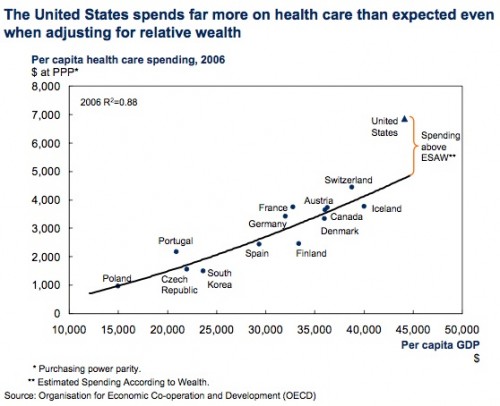
What you are seeing is a chart comparing health care spending to GDP. No one is making the argument that we should not be spending more on health care than other countries. We are richer, and it is appropriate that we therefore spend more. We would expect to get better outcomes* for that extra spending, which would also be appropriate.
But as you can see, almost every other country lines up on an almost straight line. There is a very stable relationship between how much money a country has in terms of GDP per capita, and how much it spends on health care. As countries become wealthier (moving to the right on the x-axis), they spend more on health care (moving up the y-axis). These countries aren’t working in concert. Nor are their systems the same (regardless what you’ve heard). And yet, they all seem to have found the sweet spot. They all seem to have found the same ratio of wealth to spending.
This makes sense in its own way. At some point, you can spend more money and not get the same rate of return. At some point, you exhaust your resources and you’re wasting money. It is not inconceivable that most systems find an equilibrium. That is likely along the line.
There is one exception – the United States. We are way above that line. Moreover, it’s debatable that we are achieving better outcomes than these other countries. That would suggest that the money we are spending above the line might be, for lack of a better word, waste. Regardless, that money is more than you might expect, based on every other country in the world. If we explore how that extra money is being spent, we can start to think about where spending might be cut.
This is the concept that I will follow through this series. I am going to talk about the money we spend that is more than you’d expect given our wealth. It is the money that we spend above the line. It’s the money that we likely could focus on first as something potential to cut. It’s the money that is most likely to be the least cost-effective.
Make no mistake, though. These decisions won’t be popular. They won’t be easy. That orange line, the spending above what you’d expect for our wealth, though, accounted for $643 billion in 2006. It’s more now. It’s huge.
If you were expecting a bad guy here, you’re going to be disappointed. There is no one thing to blame. There is no one fix we can make. It really is multifactorial. But it’s my hope that when we’re done here, you will have a better understanding of why our system costs more, regardless of whether you agree with that spending or not.
Schedule
This series will include one post each weekday over the next two weeks. The link in each item below will become live once the post is up.
- Introduction — September 20, 2010 (this post)
- Inpatient Care — September 21, 2010
- Outpatient Care — September 22, 2010
- Drugs — September 23, 2010
- Administration and Insurance — September 24, 2010
- Investment in Health — September 27, 2010
- Health Care Workers — September 28, 2010
- Areas of Underspending — September 29, 2010
- Red Herrings – September 30, 2010
- Conclusion — October 1, 2010
- Responses to Comments
- Responses to Comments, ctd.
*You will see that I describe our lack of better outcomes a number of times. While this series focuses on costs, I think a future series will be dedicated to outcomes.

