Sam Richardson, Aaron, and Austin submitted a more efficiently worded version of the following as a letter to The New England Journal of Medicine (NEJM). They rejected it on the grounds that our point of view would be adequately represented among the letters accepted for publication. Those letters are not yet published.
The Oregon Health Insurance Experiment (OHIE), a randomized controlled trial (RCT) of Medicaid, failed to show statistically significant improvements in physical health; some have argued that this rules out the possibility of large effects. However, the results are not as precisely estimated as expected from an RCT of its size (12,229 individuals) because of large crossover between treatment and control groups.
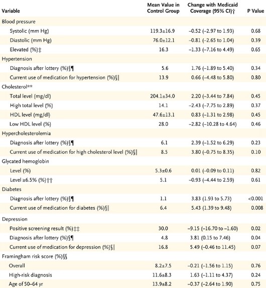
The Experiment’s low precision is apparent in the wide confidence intervals reported. For example, the 95% confidence interval around the estimated effect of Medicaid on the probability of elevated blood pressure spans a reduction of 44% to an increase of 28%.
We simulated the Experiment’s power to detect physical health effects of various sizes and the sample size required to detect effects sizes with 80% power. As shown in the table below (click to enlarge), it is very underpowered to detect clinically meaningful effects of Medicaid on the reported physical health outcomes. For example, the study had only 39.3% power to detect a 30% reduction in subjects with elevated blood pressure. It would have required 36,100 participants to detect it at 80% power. Moreover, such a result is substantially more than could be expected from the application of health insurance.
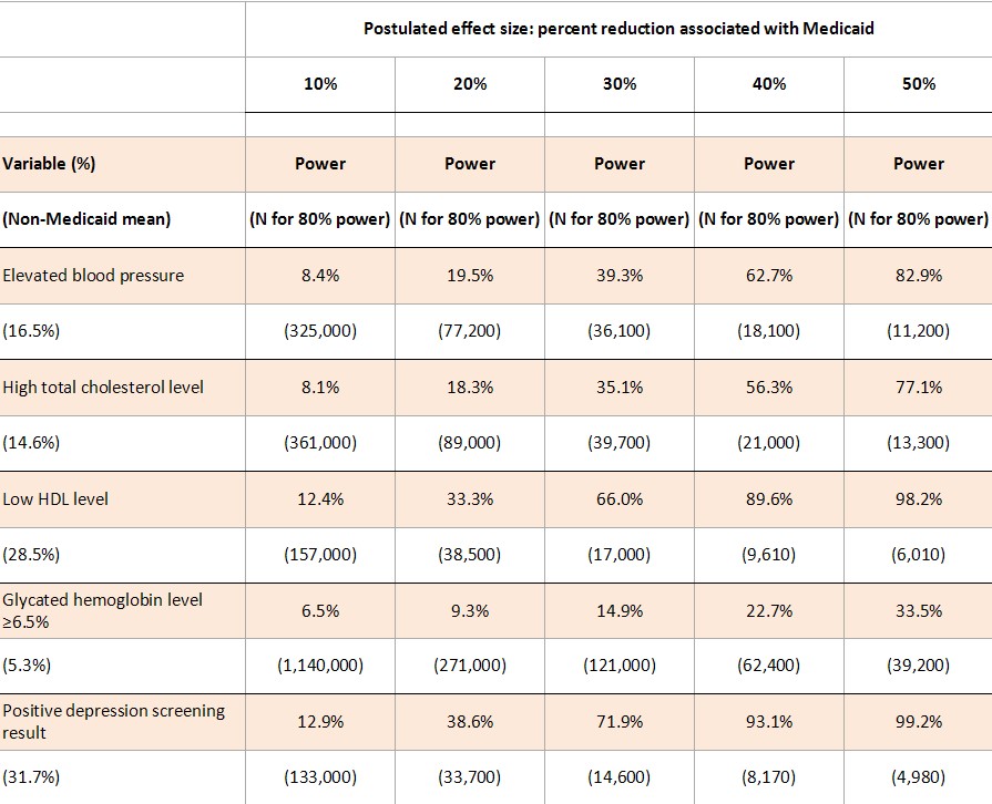
To estimate power levels shown in the table, we ran 10,000 simulations of a dataset with 5406 treatments and 4786 controls (the study’s reported effective sample sizes given survey weighting). We took random draws for Medicaid enrollment based on the probabilities reported in the study. We took random draws for each outcome: probabilities for the non-Medicaid population are given by the control group means from the study, adjusted for the 18.5% crossover of controls into Medicaid; the probability of the outcome for those on Medicaid is X% lower than the probability for those not on Medicaid, where X% is the postulated effect size.
For each simulated dataset, we regressed the outcome on the indicator for treatment (winning the lottery), and the power is the percentage of the 10,000 iterations for which we rejected at p = 0.05 the hypothesis that winning the lottery had no effect on the outcome. To estimate the total sample size required for 80% power, we conducted a grid search for the lowest sample size that provided 80% probability of rejecting the null hypothesis, running 1000 simulations for each sample size. Our required sample sizes account for sampling weights, and are therefore comparable to the 12,229 total subjects from the study. We do not account for clustering at the household level or controls for household size (and demographic controls from the blood pressure analysis).
Simulations were validated by comparing a subset of results to results that were computed analytically based on the 24.1 percentage point increase of Medicaid enrollment among treatments.Our simulation Stata code is available for download here. The analytic method is described here.
The Experiment was carefully conducted and provides a wealth of new information about the effects of Medicaid on household finances, mental health, and healthcare utilization. However, it was underpowered to provide much insight into the physical health effects of Medicaid.
***
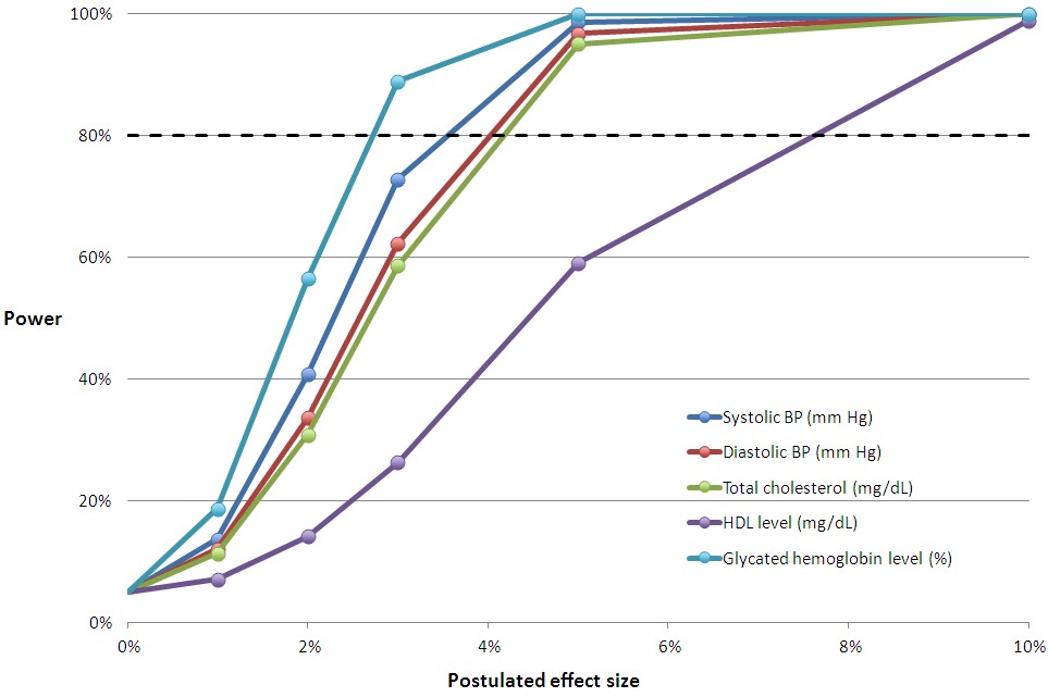
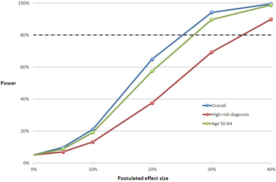
Not included in our letter were the charts at the end of this post that relate effect size to power for all the measures in the study’s Table 2. To help you translate the proportional effect sizes into absolute values, first, here’s Table 2:
Table 2 from the OHIE
You can multiply the relative effect sizes in the charts below by the control group mean to convert them to an approximation of the absolute, postulated effect size with Medicaid coverage. The horizontal line at 80% is the conventional cutoff for adequate power.
The relative effect sizes in the middle chart below may seem small. But, remember, this is for the entire sample of subjects, most of whom are not candidates for improvement in these measures. They don’t have a blood pressure, cholesterol, or glycated hemoglobin problem. When you adjust effect sizes for the proportion of subjects with such issues and compare those to the literature, you find that the study was underpowered. We’ve already blogged about this here and here. For Framingham risk scores, the literature is uninformative, and we cannot conclude whether the study was adequately powered for those.
Hopefully you can match up the lines in these charts with Table 2 from the study, above. If you have any questions, raise them in the comments.