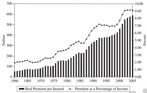
Here’s another good graph from Rex Santerre and Stephen Neun. It appears in the eleventh chapter of their book Health Economics: Theories, Insights, and Industries Studies.
The left-hand scale is in 1960 dollars. There’s nothing new here, it’s just a nice long time series. Other than a few periods, premiums have gone up, as well as premium as a percent of income. The only period of level or declining premiums I know anything about is the 1990s, the era of managed care. There are other, shorter periods of stable or falling premiums. A few years are like that in the 1960s, 1970s, and 1980s. Can anybody explain any of those?


