If you haven’t seen it yet, you should go check out Matt O’Brien’s catalogue of the 41 most important policy stories of 2013—in charts. I offered up the graph on early enrollment trends in Massachusetts; last month I teased out its implications more fully in a post titled “This chart should be getting more attention“.
I actually sent Matt three of my favorites to choose from. Since only one could make the cut, I figured I’d share the other two here.
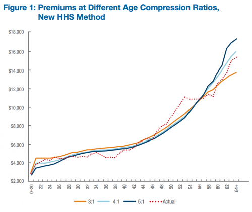
Contrary to popular belief, there isn’t much young-subsidizing-the-old going on in Obamacare: The fact that young, healthy people are seeing pre-subsidy increases in health insurance premiums is often misattributed to the restriction on age-rating (insurers only being allowed to charge their oldest beneficiaries three times what they charge the youngest). But relaxing the age band would have little impact on premiums for young adults. The increases are primarily being driven by prohibiting insurers from discriminating along health status and requiring more comprehensive floor for minimum benefits (Austin and I wrote a Bloomberg op-ed on this, here). Oh, and this chart is pre-subsidy.
Study: Why the ACA’s Limits on Age-Rating Will Not Cause “Rate Shock”: Distributional Implications of Limited Age Bands in Nongroup Health Insurance by Linda Blumberg and Matthew Buettgens (Robert Wood Johnson Foundation, 2013)
The red dotted line represents the variation in premiums that would be expected if age rating varied by the average covered expenses of those individuals actually expected to enroll in nongroup coverage under the ACA. The 3:1 age gradient developed by CMS is reasonably consistent with expected enrollee expenses, particularly for those up to age 27 and for those age 42 and older. Using the 5:1 age gradient would tend to undercharge young adults relative to their actual expenses and overcharge older adults relative to their actual expenses.
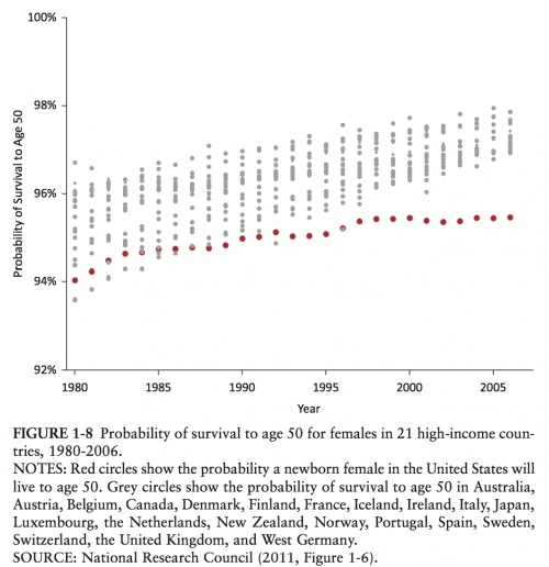
Health outcomes in the United States are depressingly bad: Aaron has covered this beat far more thoroughly than me (see here, here, and here, just to start), but I think this chart is one of the more elegant depictions of “best in the world, my ass.” Despite having the highest health spending of any nation in the world, we fare very poorly when it comes to actual health outcomes. And it’s not just that we’re bad—we’re declining. This chart shows the probability of women in the United States surviving to age 50, compared to 21 peer nations. And no, the gap isn’t entirely attributable to neonatal mortality or violence/accidents—you’ll find a more thorough discussion of the chart and the differential causes of mortality in an old Project Millennial post of mine.
Study: U.S. Health in International Perspective: Shorter Lives, Poorer Health (Institute of Medicine, 2013)
Although the United States has shared in these improvements, it still forfeits the most years of potential life before age 50. […] This mortality gap has also grown significantly over time. In 1990, U.S. females and males lost approximately 35 percent more years of life before age 50 than did those in other high-income countries, but by 2009 this figure had grown to nearly 75 percent.
Adrianna (@onceuponA)


