
There’s a chart from Jonathan Gruber that’s been making the rounds; most recently Ezra Klein featured it as one of “seven reasons Obamacare isn’t facing a death spiral.” It contrasts enrollment during the early months of Massachusetts’ exchange opening in 2007 with the last month of open enrollment—the enrollee population climbs from 123 in the first month to 36,167 by the end (about a year later).
But that chart only tells part of the story. It’s not just that we should expect early enrollment to be slower—we should expect it to be slower, older, and sicker. And we shouldn’t expect it to ramp up until the mandate’s just about to kick in, which happens after open enrollment ends on March 31. This is a key takeaway from the Massachusetts experience, studied by Amitabh Chandra, Jonathan Gruber, and Robin McKnight. (Austin covered this way back in January. Of 2011.)
This chart depicts new (not cumulative) enrollment by month and health status for the subsidy eligible population between 150 and 300% of the federal poverty line. Here, “chronic illness” is defined as a diagnosis of hypertension, high cholesterol, diabetes, asthma, arthritis, and effective disorder, or gastritis within a year of enrollment. Massachusetts’s mandate became fully operational in December 2007.
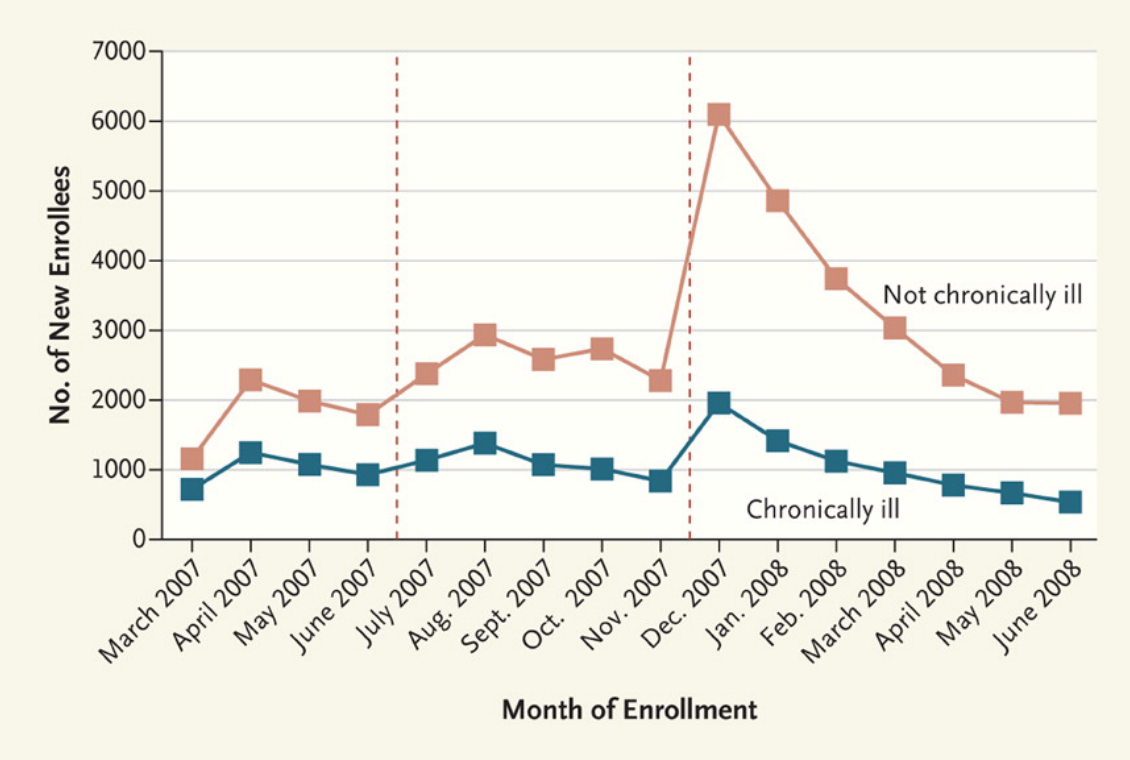
When the mandate became fully effective at the end of 2007, there was an enormous increase in the number of healthy enrollees and a far smaller bump in the enrollment of people with chronic illness. The gap then shrank to premandate levels as the remaining uninsured residents complied with the mandate, but clearly the mandate brought many more healthy people than nonhealthy ones into the risk pool. The large jump in healthy enrollees that occurred when the program became fully effective suggests that enrollment by the healthy was not simply slower than enrollment by the unhealthy, but rather that the mandate had a causal role in improving risk selection.
Here’s another key detail: the first-year penalty in Massachusetts was $219. What people forget when they talk about the ACA penalty is that $95 is the minimum penalty for those who don’t enroll in coverage; it’s actually $95 or 1% of income above the tax filing threshold, whichever is greater. Everyone making more than $20,000 will be on the hook for more than $95, and any individual earning more than $32,000 will face a penalty that’s effectively greater than the penalty Massachusetts enforced in the first year. Once it’s fully phased in, Austin has found that the average penalty under the ACA will still exceed its Massachusetts counterpart.
All of this to say: early enrollment numbers don’t really matter (see also: Sam Baker). The administration could extend open enrollment (see Nick’s latest post) or delay the penalty—but there is absolutely no reason for them to make that decision until we see what enrollment trends look like in March, when the looming specter of the mandate kicks people into gear.
Update: I edited language about the penalty to properly reflect the “1% of income above the tax filing threshold” (refer to the first comment on this post).
Adrianna (@onceuponA)
