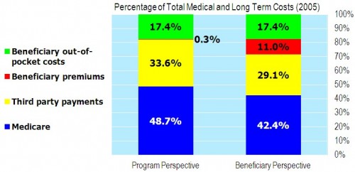
In his book The American Health Economy Illustrated, Chris Conover’s charts are prettier than the one below. He shared this pre-pub version with me for posting purposes. At first glance, don’t worry about the left-hand bar in this figure. (Below the chart I’ll get into details.)
Look at the right bar. See the blue area at the bottom, labeled 42.4%? That’s the percent of total medical and long-term care spending that Medicare pays for. The rest is covered by supplemental plans (employer wraparounds, individual Medigap, Medicaid), beneficiary premiums, and cost sharing. Medicare itself is far less generous than most people probably believe. Note the date, 2005. That’s before the drug program kicked in. So, this is just Medicare Parts A, B, and C.
And the details? Here’s the figure caption:
The program perspective counts all Medicare spending under Medicare and all bills paid through public and private third party payers under third party payments. Beneficiary premiums include only administrative costs related to Medicare and such payers. The beneficiary perspective includes the full amount of premiums paid to Medicare and third parties under beneficiary premiums and deducts these amounts from Medicare and third party payers.
If that’s still not clear to you, don’t worry about it. I don’t consider it important. The right-hand bar is good enough.
Here are the indicated sources: KFF, BCBS, Medicare Trustees, and author’s calculations.


