
Here’s another chart from the JAMA study “The Anatomy of Health Care in the United States“:
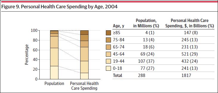
From it, we can compute average health spending by age, in 2004. I’ve shown that below alongside an estimate of what that spending is today, assuming 2.5% growth per year since 2004, which seems at least roughly right:

Medicare really is acting like a high risk pool. (There is some confounding since Medicare coverage itself plays a role in higher spending.)
UPDATE: You’ll fine more health spending statistics by age and other characteristics here. H/t @bdhumbert.
