Aaron noted a recent JAMA study titled “The Anatomy of Health Care in the United States.” It turns out it’s chock full of great charts. We like charts! So, I’ll share some over the next few weeks. Here’s one that you’ve no doubt seen before, or part thereof. Still, it’s too nice a chart not to share.
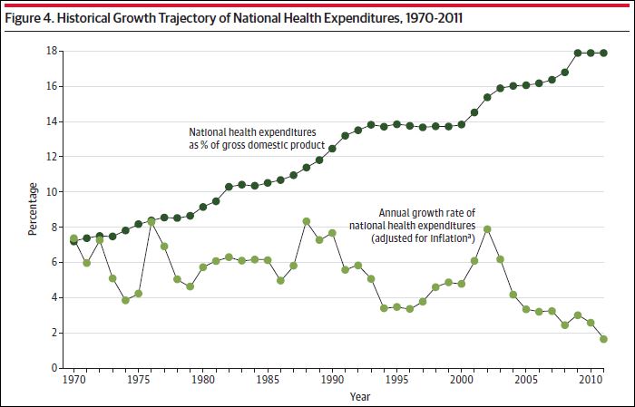
It certainly puts the recent slowdown (bottom time series) in perspective, doesn’t it? Unprecedented.
by health care attorney on December 2nd, 2013 at 07:35
What about the CMS projections?
http://content.healthaffairs.org/content/early/2013/09/13/hlthaff.2013.0721
When economy picks up and coverage expansion begins (according to CMS) cost curve bends up.
Are you and Aaron really claiming that between the huge medicaid expansion and subsidies that healthcare costs under the ACA; that healthcare spending will reduce?
Really?
by Jake on December 2nd, 2013 at 10:37
Can you expand on what you mean by ‘unprecedented’? To my eye, nothing in the last few years on this chart looks unprecedented, e.g. there is a large drop in the late 80s to early 90s in the rate of growth.