
The US has reduced its commitment to health research. The decline in support for health research has many consequences, none of them good. One consequence may be to concentrate health research funding in a small number of institutions.
You can see the overall decline in this graph (from Harvey Fineberg):

The next graphs describe the trend at Johns Hopkins University (from grantome.com).
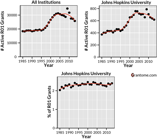
The upper left graph presents counts of R01 grants — the principal NIH research grant — given out since 1985. The upper right hand graph shows the trend for Hopkins. The absolute number of R01s going to JHU has recently declined, mirroring the overall trend.
Now Hopkins is a special case: it receives more R01s than any other university or hospital (2.4% of all R01s). The graph on the bottom shows that despite the absolute decline, JHU’s R01 share has been steady for a long time. Grant competitions are zero-sum games and Hopkins is holding its own against the competition.
There is an interesting trend in the relative positions of the top 100 universities dominating biomedical research.
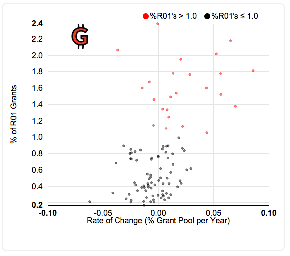
The vertical axis is the proportion of the total R01s received by an institution in 2013. The horizontal axis is the rate of change in that proportion, with institutions that have increased their share of funding to the right. The vertical axis is the change from 2010 to 2013 in the proportion of graphs held by the institution. The folks at grantome.com interpret this as showing that the rich are getting richer.
You have probably noticed a problem with this graph. To show that the rich are growing richer, grantome.com ought to have looked at whether the proportion of grants held in 2010, not 2013, was associated with the change from 2010 to 2013. But let’s suppose that the corrected graph would show something like the above pattern: that the institutions that already have the most grants are increasing their shares of the R01 funding.
Why would that happen? Researchers get a lot of advantages from being at a research-focused school or hospital. Biomedical research is multidisciplinary and at a big shop it’s easier to find highly talented specialists with the skills you happen to need on your research team. Big research factories may provide better mentorship for junior researchers. Conversely, many of these schools ruthlessly cull faculty who lose grant competitions. As funds dwindle and the competition gets more intense, perhaps these advantages become more important.
Is the concentration of the grant wealth in fewer hands good or bad for science? I have no idea. Maybe the most efficient way to carry out biomedical research is to have a relatively few large super-universities
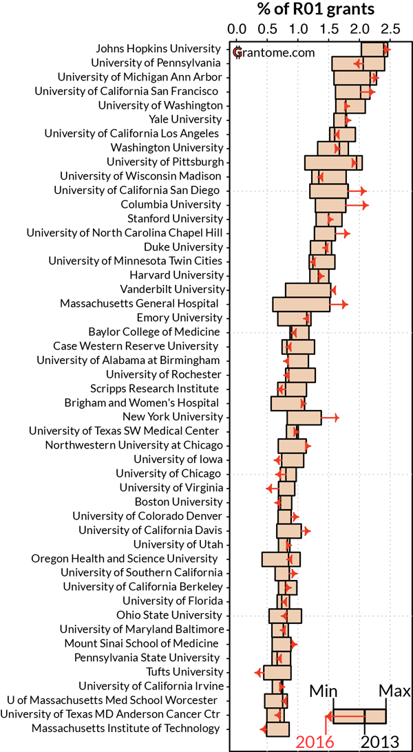
But if you look at the graph of the 50 most successful universities, something else leaps out. 42 of the top 50 are in ‘blue states’ (that is, carried by Obama in 2012), including the top 13. Most of these top schools have seen an increase in their R01 share since 2010. Five of the 8 red state schools have seen a decline in the proportion of R01s they received.
This isn’t because Obama has steered funding towards ‘his’ states. I’ve served on many NIH grant review committees. Politics never comes up.
More importantly, the pattern can’t have much to do with contemporary politics. The advantage held by northeastern and west coast schools has been around forever. It stems from — but also partially explains — the historical economic advantages of the blue states. You can see the geographical disparities in scientific achievement in other data. Richard Florida mapped the per capita distribution of scientific citations.
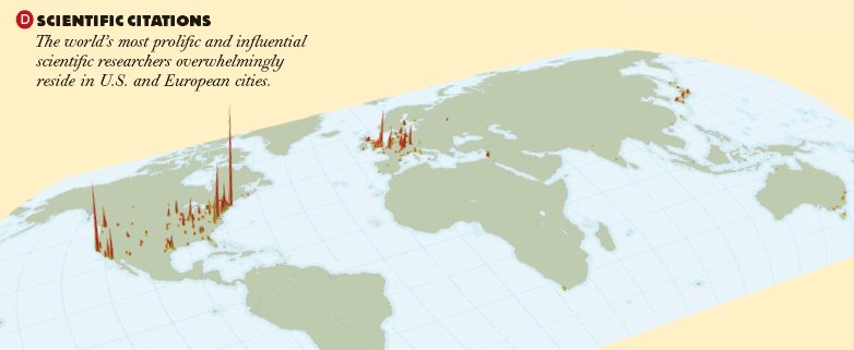
The colored peaks are concentrations of scientific productivity. Thomas Friedman had claimed that the world is flat: you can live anywhere and be part of modern scientific culture. Florida showed that this is absurd: the scientific world is spiky. Post-war global science has been led by the US, but not really. It’s been dominated by Massachusetts, the Washington-NYC corridor, and California.
Here are my concerns about the rich getting richer. First, increasing concentration of science on the coasts will increase US regional economic and educational disparities. Red state members of Congress cutting the NIH are hurting their constituents’ children. Second, a greater concentration of scientific dominance in a few liberal states is to the disadvantage of the NIH, because over time it must further erode broad political support for medical science. And what diminishes the NIH is greatly to the detriment of the nation as a whole.
h/t to David States (@statesdj), where I first learned about the grantome.com site.
