The bomb at the center of health services research has detonated. It’s this: patterns of diagnosis do not simply reflect patient characteristics. They are, in part, a function of provider practice patterns. What that means is that the standard methods of risk adjustment in many observational studies are not what they seem.
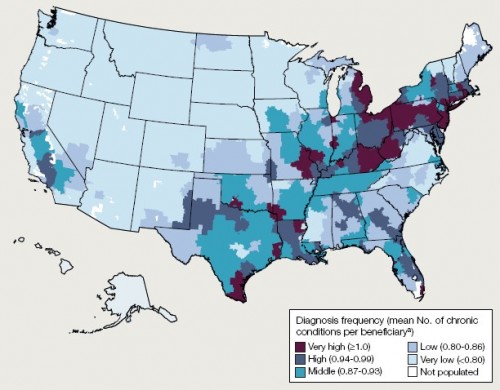
The map below is from a recent JAMA paper by Welch, Sharp, Gottlieb, Skinner, and Wennberg. It reveals substantial variation in the rate of diagnosis of chronic conditions for the Medicare population. If we believe that diagnoses reflect only patient characteristics, then we would conclude that there is a very sick cluster of patients in south Texas, across Pennsylvania, in much of New Jersey, in eastern Michigan, and other areas shaded in maroon. Conversely, we’d believe that people are very healthy in the upper mid-west, the pacific north-west, North Carolina, Virginia, and other areas in light blue.

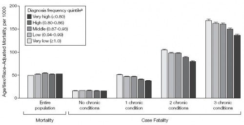
Is this right? Is there really this much variation in illness? If there were, one would expect the variation in mortality to correspond. More illness should mean more death, all other things being equal. The authors of the JAMA study took a close look at this. The following chart illustrates some of their results. It’s a bit complicated, so I’ll explain.
In general, as the number of chronic conditions goes up, so does mortality. That’s why the bars generally get bigger from left to right across the chart. People with no chronic conditions die at a lower rate than those with three chronic conditions. Within these number-of-chronic-condition groups, the researchers stratified by the regional diagnosis frequency quintile. As best I can tell from the text, this is the same way the above US map was broken up. That is, the numbers in the parentheses of the legend are wrong (they’re ordered exactly backwards). Dark means higher frequency of diagnoses.
What the chart shows is that, controlling for number of chronic conditions, mortality rates are lower in regions with higher rates of diagnoses. The more the population is diagnosed, the less they die. Weird! Naturally, the authors have an explanation for this, and it makes a lot of sense.
[G]eographic variation in diagnosis frequency substantially reflects the intensity of observation. This is consistent with the associations we report between diagnosis frequency and measures of physician encounters and diagnostic testing. This explanation provides a more parsimonious explanation for our case-fatality findings; ie, if diagnosis frequency reflects intensity of observation, then the pattern of case fatality we observed here would be expected. More testing and more opportunities to make diagnoses may translate into the typical patient given a diagnosis being less sick. The finding of Song et al [link]—that the number of diagnoses accumulated by migrating Medicare beneficiaries is associated with the location to which they moved—provided evidence from a natural experiment that supports this hypothesis.
The more doctors you see, the more sick you appear, even if you’re not really any sicker from your cousin across the country who sees fewer doctors. Regional practice patterns affect your level of diagnosis. This is both obvious and bad news.
If diagnosis is not solely an attribute of underlying disease burden, adjustments based on frequency of diagnosis may introduce bias into efforts to compare outcomes, pay for health care, and assess the extent of geographic variation in health care delivery.
Of course purposeful or natural random experiments can overcome this problem. But such things are rare. That’s why risk adjustment is at the heart of health services research. One can’t very well submit a study that doesn’t do it. It’d be laughed right out of the journal’s editorial office. But now we can’t be sure what risk adjustment is really adjusting. Is it a patient effect or a provider effect? If you look sicker, are you? Or did you just see more doctors?


