
If you haven’t read the health care chapter (PDF) of the 2013 Economic Report of the President, it’s worth at least a glance. At least look at the charts.
My favorite chart is the following that shows a time series of Medicare hospital readmission rates. I don’t like it necessarily because the rates have dropped recently, though that may be a very good thing. I like it because of the questions it raises, which I pose just below the chart.
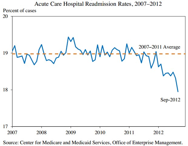
- Why, exactly did rates fall since 2011? One guess is anticipation of the penalties associated with the Hospital Readmissions Reduction Program. If that’s correct, it is remarkable what a little skin in the game can do, isn’t it? Note that public reporting of readmission rates, which Medicare has been doing for years, didn’t change a thing.
- If hospitals caused readmission rates to fall, how did they do it? Does it reflect better care or somehow gaming the measure or a combination of both? What would a study of the variation in rate reduction by region or hospital reveal?
- How low can rates go? The range of estimates of the proportion of readmissions that are preventable is absurdly wide: 5%-79%. The chart above shows we’ve already shed readmissions consistent with the low end of this range.
There are other good charts in the report.
My least favorite chart is the one illustrating that life expectancy after cancer diagnosis has increased in the U.S. faster than it has in selected European countries. It accompanies another chart that shows spending on cancer care in the U.S. rising as it stays relatively flat in Europe. The implication is that we’re getting value for our money. But …
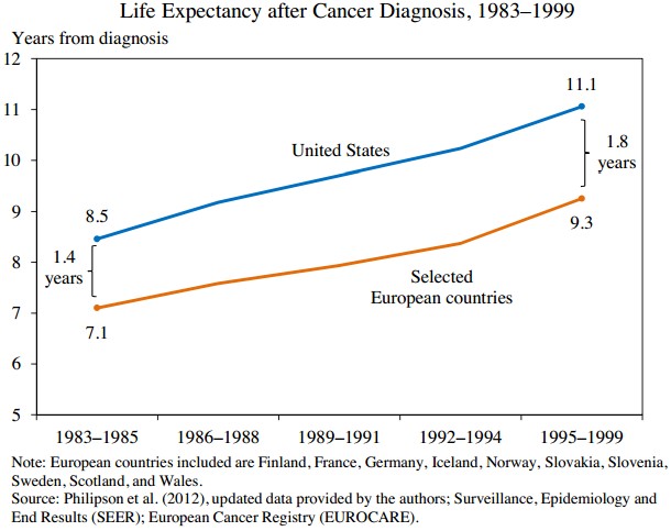
… life expectancy after diagnosis — a close cousin of survival rate — is a terrible way to assess value. As Aaron has written about many times, survival rates suffer from lead time bias. The source of the chart above is Philipson et al. (2012). Aaron already addressed the issues with that study here and here. I’m disappointed that the authors of the report didn’t note any of them.
In the section of the report in which this chart appears, the authors are attempting to convey what we know about productivity growth in the health care sector. They cover other studies and wind up saying it’s hard to assess whether productivity is increasing or not. Given that conclusion, it doesn’t seem honest to me to use a chart based on one study that suggests a productivity gain. They might have just as easily included a chart like this, from Robert Kocher and Nikhil Sahni:

I do not necessarily believe the Kocher/Sahni figure any more than I believe the one implied by Philipson et al. But I do know this: If we base our thinking about the value of the health system on cancer survival rates we are going to mislead ourselves.
