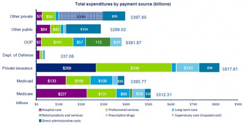
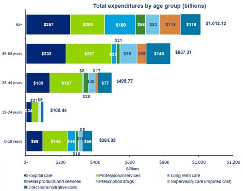
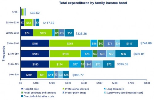
Deloitte has published an analysis titled The Hidden Costs of U.S. Health Care for Consumers. I thought some of the figures were interesting, providing a visual exploration of where health care dollars go, stratified in various ways. Three are below (click to enlarge). Note: the dark blue bar for “Private insurance” in the first graph below ($268) seems to be mis-colored. I think it should be magenta, representing hospital care.
UPDATE: Noted the mis-colored bar in the first chart.
by AndyS on April 29th, 2011 at 08:44
On the first chart (Total Expenditures By Payment Source), the first value on the Private Insurance line ($268 billion) doesn’t seem to be identified in the legend. What does this dark-blue block represent?
by Floccina on April 29th, 2011 at 08:59
That has to be hospital care. Wrong color I guess?
by Austin Frakt on April 29th, 2011 at 08:59
The order of items should be the same in all the bars. So, I think it is mis-colored and is really hospital care. Notice they seemed to have switched colors for that item in the other charts. Kind of a “typo,” though a bad one. Thanks for pointing it out.
by Floccina on April 29th, 2011 at 09:15
So how do we lower Professional Services and Hospital care.
Single payer advocates call for the use of monopsony to force prices down.
Economic freedom advocates (like me) would call for easing of licensing and ending the tax advantage for employer provided insurance.
Since, your other post shows that neither the USA with its mixed system nor the socialized medicine countries have yet been able to stop spending from increasing faster than GDP, it is understandable that people would differ on which option above to attempt. (I do not know if Singapore reached a good level of spending growth?)
I see a few other ways to attempt to control spending. They are: price controls without monopsony (I think they use price controls extensively in Japan), and banning certain lower yield per dollar procedures and some sort of triage. I would like to see if others can think of other ways to control spending.
BTW to me spending and cost have slightly different meaning in the context of health care.
by Floccina on April 29th, 2011 at 10:05
BTW Thank you Austin Frakt for the excellent charts. Thanks to Deloitte also.
by subdee on April 29th, 2011 at 10:30
Woah, rich people are WAY healthier. Guess this doesn’t include the costs of spa treatments, exercise classes and long vacations.
by SaysKris on April 29th, 2011 at 15:37
I’m intrigued by the DOD number and the 19-24 year old number…people who don’t need/get much healthcare at all…and looking at other ways to slice and dice this data that might help us identify who the “big ticket” populations are, so we can focus on reducing costs there.
by jamzo on April 29th, 2011 at 20:35
Floccina – dean baker has written extensively on “economic protection of medical professionals” and the deleterious effect of the patent system
by josephmartins on May 2nd, 2011 at 12:13
Do vets fall under DoD spending? Seems like that number is extremely low considering the breadth of services offered and the number of past and present service members (and their immediate family members) covered by it.
Another area of interest: how much of the amount spent actually flows through to the front line personnel who provide patient services, as opposed to areas of friction that are not classified as “administrative”? For example, we know that insurers reward gatekeepers who vet claims and do everything in their power to reduce the coverage provided to policyholders and the fees paid to healthcare providers. Where does the income of these contractors fall in the breakout? Under professional services?
by Seth Krieger on May 3rd, 2011 at 13:33
If that first chart is correct, it would appear that Medicare and Medicaid do a far better job of controlling administrative costs than the private sector. So explain again why we should privatize these portions of the industry? The opposite seems to be a better way to go!