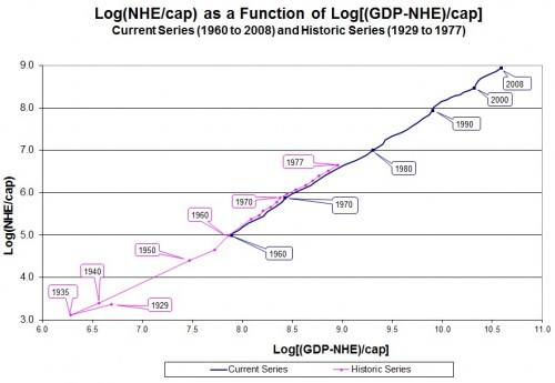
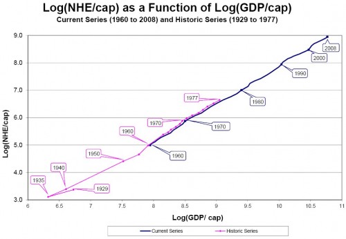
In the comments there has been a discussion of the fact that GDP includes NHE. So, one might wonder how the figure I showed in my prior post would differ if the horizontal axis was the log of per capita GDP less per capita NHE. Bob Woodward sent me the answer. That chart is immediately below. After that, I reproduce the one from his paper with Le Wang, which I had included in my prior post. If you see any substantial differences that warrant any qualitative change in conclusions, let me know.


