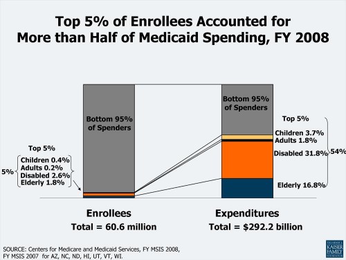
Here’s an illuminating chart brought to my attention by Jim Hufford. Pay close attention to how spending is broken out by Medicaid eligibility category. The disabled and elderly dominate within the top 5% of spenders. Kids and parents may not be consuming as much of Medicaid spending but the benefits are still very important to them.
UPDATE: I initially misread the chart. Fixed my text.


