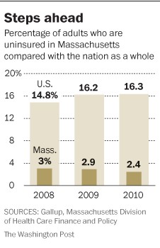
Last week Aaron and I contemplated making a graph that compared Massachusetts’ uninsurance rate with that of the nation over time. We were busy. We didn’t make the graph. But Ezra Klein included just that in his column on Saturday.
His piece credits the Bay State’s individual mandate for the ultra-low rates of uninsurance. In part, you can credit the natural low rate the state enjoys as well. It was lower than the national average before the 2006 health insurance reforms too. And, Klein also mentions all the ways in which Massachusetts’ health system is not a bed of roses, the high costs, the provider market power, and so forth. I acknowledge all that.
What I want to point out about the figure, though, is not the difference in rates, but the trend. Massachusetts’ rate of uninsurance has been going down, during the Great Recession mind you. Meanwhile, that of the nation is going up, as would be expected in a struggling economy. This comparison of rates (difference-in-differences) controls for many of the idiosyncrasies of Massachusetts. If you object to straight comparisons because you think Massachusetts is not representative of the nation (and you’re right about that) comparing rates knocks out some, though not all, of the confounding factors.
Even if the individual mandate can’t make the nation look like Massachusetts (I can almost hear sighs of relief to that), if it can reverse the upward trend in uninsurance rates, that’s something in its favor, at least as far as I’m concerned.


