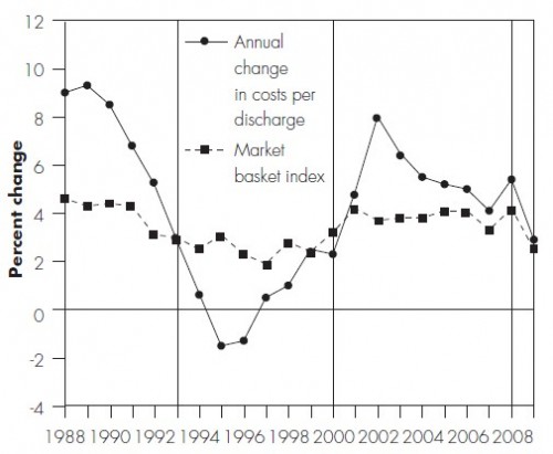
In its 2011 Report to Congress (pdf), MedPAC makes some points I made in my cost shifting paper published the same month (ungated working paper version available). The following chart, from the MedPAC report, almost illustrates them. For this figure, “costs” are Medicare “inpatient allowable costs per discharge” and the market basket index is a composite of the “prices of the goods and services hospitals use to deliver care.”
The MedPAC report describes the chart as follows, but they left out a few key pieces of information, which I’ll interject.
During the first time period (1986–1992), most insurers still paid hospitals on the basis of their charges, with little price negotiation or selective contracting. With limited pressure from private payers, hospital margins on private payer business increased rapidly.
That doesn’t quite explain the chart, which shows the rate of growth in hospital costs falling during this period. Why? The reason is that this is the period during which Congress began to ratchet down the updates to Medicare payments to hospitals. In order to try to stay afloat, hospitals began to reduce the growth in their costs accordingly. That change in costs is shown in MedPAC’s chart, but higher margins from private payers (payment-to-cost ratios) is not shown.
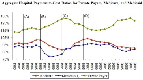
You can, however, see margins in my figure based on AHA data (below): payment-to-cost ratios from private insurers went up in this period.
Continuing from the MedPAC report,
In the second cycle (1993–1999), HMOs and other private insurers began to negotiate more assertively with hospitals, and most insurers switched to paying for inpatient services on the basis of DRGs or flat per diem amounts for broad types of services. As a result, hospitals’ payment-to-cost ratio for private payers declined by 16 percentage points. Because managed care restrained private-payer payment rates, hospitals were under pressure to constrain their costs and the rate of cost growth was below input price inflation from 1994 through 2000.
However, by 2000, hospitals had regained the upper hand in price negotiations because of hospital consolidations and consumer backlash against managed care. In the third cycle (2000–2007), private-payer payment rates rose rapidly and hospitals’ payment-to-cost ratio for private payers increased more than 16 percentage points. Due to high private-payer payments, all-payer margins for hospitals reached 6.0 percent in 2007, the highest level recorded since 1997. As expected, cost growth was high in 2008 (5.5 percent) as many hospitals started the year with little pressure to constrain costs. As we have discussed in the past, when profits on privately insured patients are high, hospitals face less pressure to constrain costs.
I explained that last point last week. Notice that “cost shifting” was not mentioned once in explaining the charts above. That doesn’t mean cost shifting didn’t occur. It does mean that other things happened too, including dramatic changes in hospital and insurer market power. Hospital prices derive from the balance of market power between the two entities. Cost and price are simultaneously determined. Hence, changes in hospital margins, both on the private an public sides, do not simply reveal a cost shifting story.


