
It’s possible I fall in love with tables and charts a little too readily. It’s a character flaw. But I do adore the one immediately below. It’s from the recent paper by Amitabh Chandra, Jonathan Holmes, and Jonathan Skinner (PDF), about which Adrianna blogged last week. It shows price, per enrollee utilization, and enrollment growth for Medicare, Medicaid, and private payers over 2008-2012.
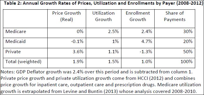
What I like about the table is that it’s so simple. Yet it reveals so much. It plainly shows that Medicare controls prices about as well as you could ask: 0% growth. Medicaid does a decent job at that too. Private payers, not so much. Wonder why your premiums went up? That private payers coughed up an average of 3.6% higher prices each year is a big reason, though not the only one.
Per enrollee utilization is another story. Here, Medicare is terrible, with 2.5% growth in that category. Medicaid also showed growth, about in line with private payers at 1%.
The simple take-away is that Medicare and Medicaid control prices very well and private payers control utilization somewhat (though no better than Medicaid).
As for enrollment growth, the Medicare figure is due to the aging of the baby boom generation. The Medicaid one is driven in large part by the economic downturn. And the negative private payer figure is a combination of both factors. (If the other two go up, something has to go down.)
Not accounted for in this table is spending for
investment in facilities and innovation, and government spending for a variety of other programs, many of which supplement the primary Medicaid and Medicare programs (for example programs to help pay for Medicare deductibles among Medicaid-eligible enrollees) or which support health care for the military, such as Veterans Affairs (VA).
Per enrollee spending growth is illustrated in the figure below. Private premiums dominate. Medicare and private payer spending are close to one another in recent years. Medicaid is amazingly flat.
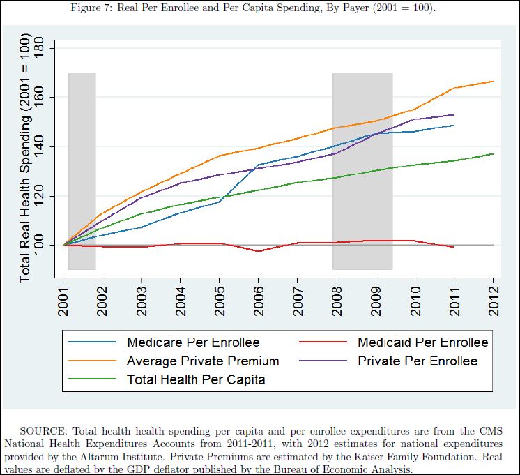
And yet, it’s Medicaid that everyone (well, not everyone) wants to cut. Don’t believe the hype that it’s because it’s so expensive. Sure, it costs more as more people enroll in it, but its per person spending pales in comparison to that of other types of coverage. A high income American receiving the employer-sponsored health insurance tax subsidy actually costs taxpayers more than an average Medicaid beneficiary. A Medicare beneficiary certainly costs more. Though I haven’t run the numbers, I’m sure that’s true even adjusting for age and health status. The real reason Medicaid is routinely on the chopping block is because poor Americans tend not to vote, and they’re largely invisible to wealthier Americans.
About this chart, see also Paul Krugman.
