
The following is a guest post by Galen Benshoof, a Master in Public Affairs candidate at Princeton University’s Woodrow Wilson School, where he focuses on health policy. Find him on Twitter: @benshoof.
The KFF team did some quick work today transcribing the latest exchange enrollment data, loading it up on their site. They made it easy to update a table I made two months ago dealing with October and November data.
Below is the new table, presenting (1) state names, (2) the proportion of consumers who have enrolled with financial assistance out of total enrollees, as of February 1, (3) the proportion of tax credit-eligible consumers who had completed applications, out of total completed applications, as of November 30, (4) the proportion of theoretically subsidy-eligible consumers out of the total population who could buy coverage on a state’s exchange, (5) the absolute difference between columns 2 and 4 (current discrepancy), and (6) the absolute difference between columns 3 and 4 (previous discrepancy).
(This time I’ve bolded State-based Marketplaces [SBM] with all states relying on healthcare.gov—whether Federally-facilitated Marketplaces [FFM] or Partnership—appearing as normal).
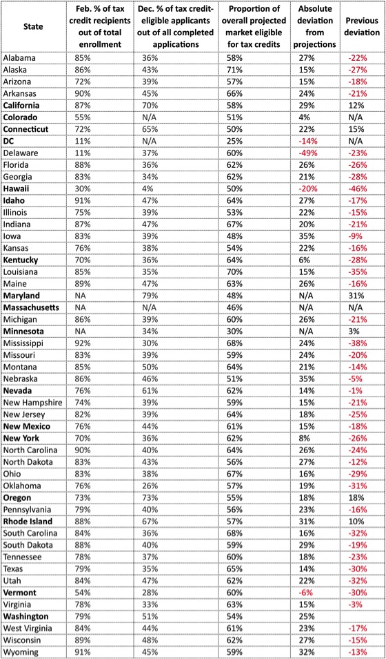
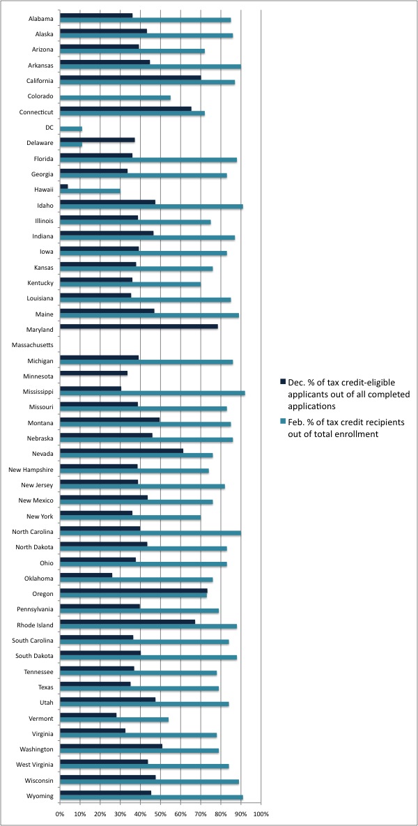
Compare the final two columns in the table to see how things have changed in a short period of time (the bar chart below shows the same thing in different form). As you can see, the previous months have seen a flood of subsidy-eligible enrollees relative to other enrollees in many FFM states. Texas, Ohio, and Florida, for instance, went from way in the red to substantially in the black. That probably shouldn’t be surprising, because those three states have high proportions of subsidy-eligible consumers in their populations, especially compared with most SBMs. Still, it’s interesting that FFM and Partnership states are now outpacing most SBMs on that account. According to ASPE, overall subsidized enrollment proportions are 79% for SBMs and 83% for FFMs (page 9 here).
Keep in mind that these subsidy percentages provide no commentary on total enrollment numbers in each state, merely the proportion of people receiving tax credits out of all enrollees. This is just one way out of many to judge the success of a state’s exchange.
In December, most states weren’t doing a good job of attracting subsidy-eligible shoppers. Many such consumers weren’t even completing applications, let alone necessarily selecting plans. Back then, states were generally far behind the overall new market proportion—hence all the red text in the last column.
Now, as their overall enrollments grow at a solid clip, most states are attracting a greater proportion of subsidy-eligible consumers than contained in their overall populations of people who could theoretically buy on the exchange. In other words, they are reaching people in need. As Andrew Sprung recently wrote, “4.16 million [applicants] are eligible for subsidies. 60% of them (2.49 out of 4.16) have pulled the trigger and selected a plan. Of the 3.11 million who have completed applications and been found ineligible for subsidies, just 594,000 — again, 19% — have enrolled in plans.” Clearly subsidized shoppers are now enrolling at much higher rates than unsubsidized shoppers. Andrew’s post, which I recommend reading in full, ponders the implications of that
(One caveat to this analysis: In December, ASPE reported the numbers of applicants deemed eligible for subsidies—we don’t know how many of them actually selected a plan at the time. Now, ASPE reports the number of enrollees receiving subsidies, meaning that it’s not an ideal comparison, but still a fair reflection of changing interest among the low-income, subsidy-eligible population, relative to people not eligible for subsidies)
A slightly different version of this post originally appeared on Galen’s blog.