
If you’ve read anything about the attack (and defense) of the ACA risk corridors as an insurance industry bailout (or not), you’ve probably learned that the Medicare drug program, Part D, also has risk corridors. (If you’re already confused, read this.) It got me wondering, how similar are the two risk corridor programs?
Of course, it’s a bit unfair to compare the two programs on one component, as they differ in many other ways. Part D and the ACA’s coverage expansion are very different in design, implementation, covered population, scope, and so forth. Both programs include other risk adjustment provisions that differ from one another as well. Another way they’re different is that the Part D risk corridor program is ongoing, while the ACA’s lasts only three years. (One way the programs are similar, interestingly, is that they both cost about the same, $1 trillion over 10 years, though they differ in the extent to which that cost is offset by other savings or revenue.)
With all that in mind, here, again, is a chart that summarizes the ACA’s risk corridor program:
ACA Risk Corridor Program (2014-2016)
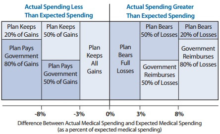
(Source: American Academy of Actuaries fact sheet)
Here’s what the Part D’s program looked like initially (2006-2007):
Part D Risk Corridor Program (2006-2007)
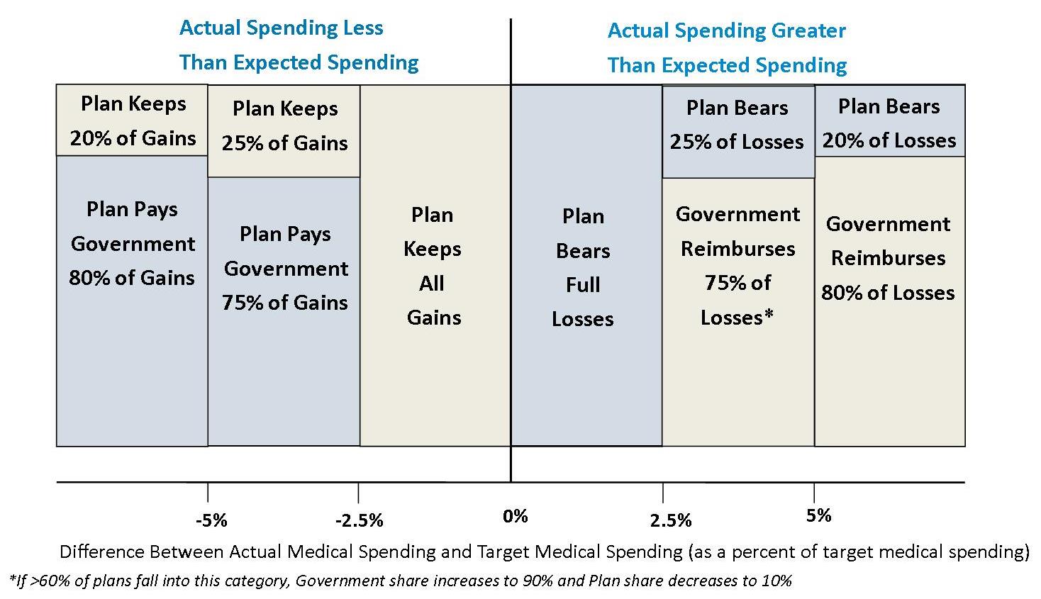
(Source: Federal Register, 10/1/10 edition (42 CFR 423.336-“Risk-sharing arrangements”)
If you compare those two charts, you’ll see that, in terms of risk corridors alone, the Part D program was generally more protective of plans than the ACA’s program is. The flip side is that Part D plans gave more back to the government if they spent less than expected than will ACA exchange plans. For example, a Part D plan in 2006 or 2007 that spent between 2.5% and 5% more than expected only bore 25% of those losses (and only 10% if more than 60% of plans fell into this category). An ACA plan has to spend 3% more than expected before bearing any loss, but then it splits losses 50/50 with the government, up to a actual spending 8% above expected. You can read the rest on the charts.
So, again considering risk corridors alone (which I admit is not a complete way to examine these programs), one can’t attack the ACA program as a “bailout” without saying the same of the early Part D program. Did anyone make that charge about the Part D risk corridor program, circa 2006? (Drop me a note if you find a reference to that effect.)
I’ve compared the early Part D risk corridor program to the temporary ACA’s because both were designed to stabilize the early market. However, the Part D program continued. Below, for completeness is what the Part D risk corridor program looked like after 2007.
Part D Risk Corridor Program (2008-2013)
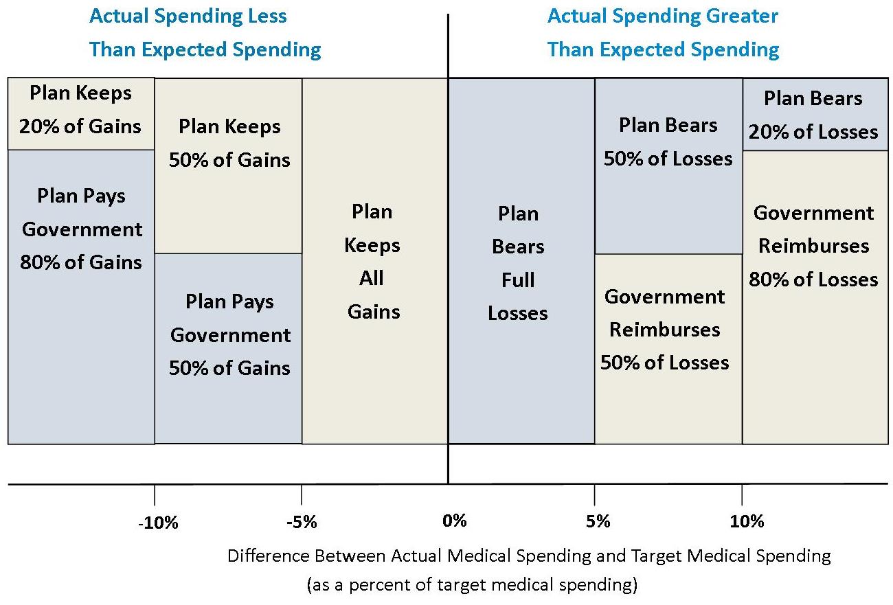
(Source: Federal Register, 10/1/10 edition (42 CFR 423.336-Risk-sharing arrangements” through 2011; CMS extended risk corridors at same level in 2012 (page 32 at the link) and again in 2013.)
Acknowledgements: I thank Daniel Liebman for making the Part D charts above, and tracking down information to do so, with some leads from Adrianna.
