Before I get into it, with this post I am not claiming that health spending on physician services is the only or even the most important reason for overall health spending growth. What I’m really doing is documenting some figures I’ll be using in a talk. Since I went to the trouble of making a figure, and copying another, I might as well practice getting my thoughts straight about them here. You get to see the rough draft. (Lucky you. Of course, you can avert your eyes if you wish.)
We all know that Medicare has a physician fee schedule, the basic structure of which governs how private insurers pay physicians as well (which is not the same thing as saying private plans pay physicians the same rates as Medicare; they don’t). It’s the overall growth in Medicare physician fees that is the subject of much, and frequent, debate: the “doc fix.”
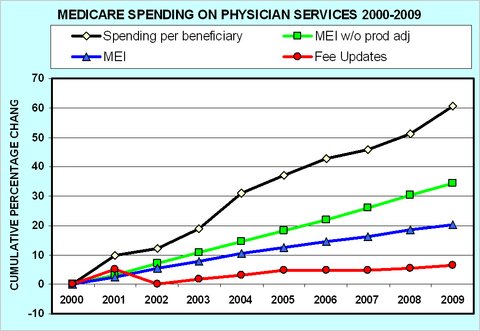
About that, last month Uwe Reinhardt posted some intriguing graphs that illustrate what a mockery the doc fix issue and the system it aims to “fix” have made of the control on costs they’re supposed to exert. From those, here’s the graph I’ve selected for my talk.
Reinhardt explains,
The lowest line in the first chart (in red) shows Medicare’s fee increases from 2000 to 2009. […]
[T]hat line is so much lower than the green line, which represents growth in the M.E.I. [Medicare economic index], the index that measures the annual increase in the cost of operating a medical practice. […]
Indeed, even if one assumed that the M.E.I. should be adjusted downward a bit because physicians should be able over time to increase the productivity with which practice inputs are used, basing fees on the productivity adjusted M.E.I. (the blue line) would still have raised Medicare’s physician fees substantially more than the actual fee increases.
Finally, however, the top line (in black) shows that, in spite of Medicare’s miserly fee updates [the red line], total Medicare spending on physician services per Medicare beneficiary actually has grown by fully 60 percent from 2000 to 2009, at an average annual compound rate of 5.4 percent.
(By email, Reinhardt wrote me that he believes the figures in the chart are not adjusted for overall inflation.)
What’s driving that huge increase in physician services spending? Not fee levels (the red line), but utilization. Medicare’s inability to control utilization is, by now, a familiar bugaboo of its payment system, the very reason for proposals of bundled payments, ACOs, and the like.
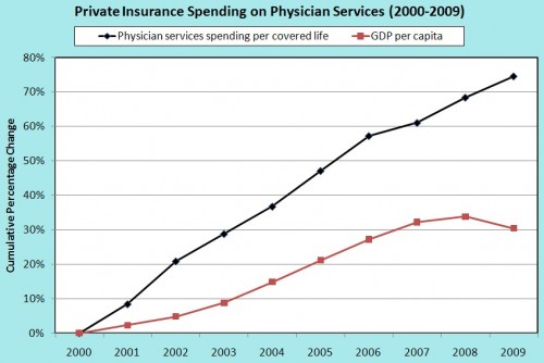
Since private plans piggyback on the structure, though not payment levels, of the Medicare physician payment system, I wondered how the rate of increase in spending by them compared. Unfortunately, after much searching, I could find no figure comparable to the one produced by Reinhardt, above. So, I made my own, using National Health Expenditure data for private plan physician spending and OECD/Census data for number of people insured by such plans. Here’s the resulting figure:
The black line is cumulative (nominal) growth in private plan spending on physician services per covered life. The red line, for comparison, is growth in (nominal) per capita GDP. Physician spending by private plans has far outpaced overall economic growth in the last decade.
Comparing the figures, private plan spending growth is above that of Medicare. So, perhaps Medicare’s controls on fees do have an effect, though clearly a modest one.
UPDATE: As pointed out in the comments, my use of the term “volume” above is not quite right. I should have written “utilization.” Read the comments for details.
UPDATE 2: The post and second figure have been redone because I learned that the Medicare figures are not adjusted for overall inflation.


