
Earlier this week, I compared the ACA risk corridor program to Medicare Part D’s. (Go see the charts.) What I didn’t do was convey the extent to which the risk corridor program “kicked in.” TIE research assistant Daniel Liebman found the relevant data for 2006-2007 and put together the following charts that tell the story.
As you can see from the first chart below, the vast majority of Part D risk corridor payments flowed from insurers to Medicare, in both years. That is, insurers’ actual costs were lower than expected, and by a wide margin. However, this is not universally true, so some payment did flow the other way, helping to protect some insurers from unexpected losses.
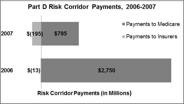
Data Source: Office of the Inspector General, Department of Health and Human Services: “Medicare Part D Sponsors: Estimated Reconciliation Amounts for 2006”
The next chart below shows the percentage breakdown of plans according to whether they gave/received no risk corridor payment, paid money to Medicare, or received money from Medicare. Here we see a bit more of the value of the program. In 2007, for example, 24% of plans received a payment, buffering their losses. Even if the aggregate dollar amount was low, relative to the amount flowing the other way (per the chart above), these payments probably mattered a great deal to the plans receiving them.
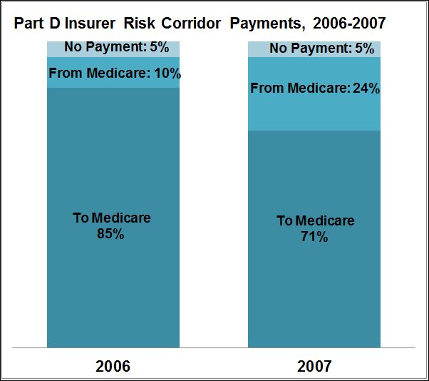
Data Source: Office of the Inspector General, Department of Health and Human Services: “Medicare Part D Reconciliation Payments for 2006 and 2007”
One thing to keep in mind about all this is that insurers were (and are) well aware of the risk corridor program (Part D’s and the ACA’s). Therefore, they are likely building in the protection it provides to their premiums and plan designs. In some sense, the losses/gains they experience aren’t “unexpected.” They know that there is some chance they’ll lose money and the feds will help them out.
One need not interpret this as corporate welfare, however. It benefits consumers too, as Galen Benshoof articulated.
One final point I’ll make is that there is a clear bias evident in the charts above. A lot more money from a lot more plans flows to Medicare than from it. This suggests the possibility that plans might be able to price their products a bit lower. It’s not a complete analysis, so I don’t want to overplay this idea. It’s also reasonable to speculate that plans are pricing close to optimally, given the level and nature of competition in Part D.
