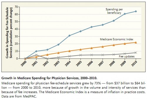
A NEJM paper by John Iglehart, Medicare Payment Reform — Proposals for Paying for an SGR Repeal, includes the following figure documenting Medicare spending for physician services. It’s similar to one I posted earlier this year (via Uwe Reinhardt) but is prettier and covers one additional year.
Notice how modest fee updates are (gray line) and how much more quickly actual spending per beneficiary grows (blue line). Finally, notice how far below per beneficiary spending growth is that of physicians costs (the Medicare Economic Index, orange line). This reveals the limitations of price control without volume control.
You can click through to my prior post and a similar one that preceded it for more commentary. Iglehart’s paper summarizes a proposal to reform how physicians are paid. It’s ungated. See for yourself.


