If you haven’t read the introduction, go back and read it now. That introductory post also includes links to all the posts in this series on how we can rate the quality of the US health care system. Each of these pieces will discuss another way to look at quality, and how the US compares to comparable countries in that domain.
We’re going to start with what may be the most controversial measurements of quality: population statistics. These are ways of measuring how a population of people compares to others. Those with better numbers are often thought to have better health care systems.
As with all metrics, they are flawed in some way. For instance, many will argue that life expectancy is due to more than a health care system. I addressed this last week, in fact. That being said, they are still worthwhile as data points, as a health care system must play at least a part in their measurement.
For each of these, I will present OECD data on the G8 countries, without the Russian Federation, which does not submit comparative data. I present the G8 countries because of all countries, these are the ones whose relative wealth and standing in the world should make them most likely to compete with us. And, for each of these measurements, I will present all available data from 1990 onwards, lest you accuse me of cherry picking a year. To make it easy to read these graphs, when I am making charts from OECD data, I will always make the United States a nice red line.
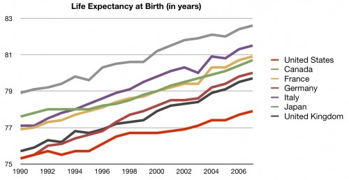
Let’s start with life expectancy, or how long a person can expect to live in a certain country when they are born:
Pretty consistently for the last 20 years, the United States has had the lowest life expectancy of comparable countries. Did I say that I acknowledge that there may be other reasons for this? Good. Then please don’t email me to tell me that.
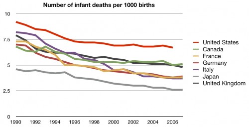
Another popular statistic in this category is infant mortality. This is a measurement of how likely a baby will die in childbirth:
Again, pretty consistently for 20 years, the United States has had the highest infant mortality when compared to comparable countries. More than almost any other metric, this one is dismissed instantly by many people; most of those people claim that we measure it “differently” than one country or another. But remember, we are worse than all of them. And, since we are supplying our own data to the OECD, why would we not complain or change our own methodology to match others if we are such outliers only because of measurement methods?
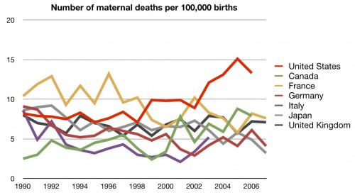
Regardless, the next metric is more difficult to explain away. Here’s maternal mortality, or how likely a mother is to die in childbirth:
Back in the 1990s we were in the middle of the pack, but things haven’t been as good in recent years. More mothers die in childbirth in the United States per 100,000 births than in any other comparable country.
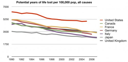
Here’s one last commonly used metric: years of preventable life lost. The OECD defines this as:
Potential Years of Life Lost (PYLL) is a summary measure of premature mortality which provides an explicit way of weighting deaths occurring at younger ages, which are, a priori, preventable. The calculation of PYLL involves summing up deaths occurring at each age and multiplying this with the number of remaining years to live up to a selected age limit.
So how does the US stack up?
The United States has more preventable years of life lost than any other comparable country.
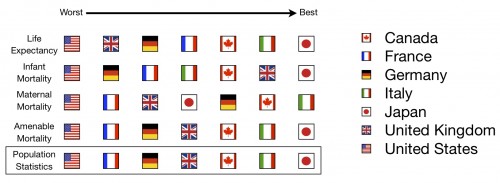
We’re off to a bad start. When it comes to population statistics like these, the US looks absolutely horrible. This leads many to the conclusion that these metrics must all be fatally flawed. I’d be more likely to agree if we weren’t dead last in all of them.
But population statistics are only one way to measure a health care system’s quality. We will need to consider many others before we come to any overall conclusions.
Here’s the first scorecard:
And here’s the running total for the series:
UPDATE: Fixed typos and chart. A further explanation of these charts can be found here.

