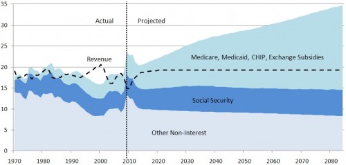
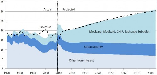
By now you know the story. If not, it’s here. I just want the 2010 CBO projections to be in the same format as the 2008 ones were. This is important because the way the data are displayed either highlights or somewhat conceals what’s driving federal spending. CBO didn’t produce consistent figures, but now I have with their data. See below. This is the right way to view this information.
Federal spending and revenue projections as a percent of GDP (CBO)
Alternative Fiscal Scenario
Baseline Scenario
Later: I updated the figures with a better color scheme.


