This post has been cited in the 9 December 2010 edition of Health Wonk Review.
One last chart from the new paper in Health Affairs that describes a recent Commonwealth Fund survey in eleven countries. I’m not going to describe the methods again, as I’ve now done so two times.
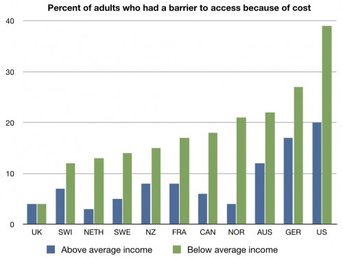
What you are looking is a graph showing you the percent of people who say that they have experienced at least one access barrier to care because of the cost. Surveyors told each participant the median income in their respective country and then asked them if their income was above or below that – and then referred to that as above or below “average”. The green bars represent those with “below average” income; the blue bars represent those with “above average” income.
It’s not just that more people in the US report access issues because of cost than any other country. It’s that even those with “above average” incomes experience these barriers. In fact, more people with “above average” incomes in the US experience cost-related access issues than people with “below average” incomes in seven of the other ten countries. It’s not just that our poorer citizens can’t afford the care; our wealthier citizens can’t either.
Last time – who thinks this system is great?


