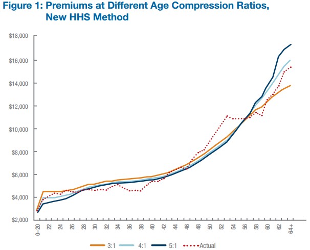
I linked to the this work by Blumberg and Buettgens earlier in the week, but I can never trust more than 2% of you to click through, let alone read the document. It’s analysis of the effect of age rating on net premiums (accounting for subsidies) in health insurance exchanges. What it shows is that the 3:1 constraint in current law (that older consumers’ premiums can’t be more than three times those of younger consumers) isn’t significantly binding, on average. It doesn’t actually do a lot to constrain older people’s premiums or increase younger people’s very much. Consequently, loosening up this regulation wouldn’t do a lot. Compare the orange line (3:1 age band-based) with the dotted line (actual premiums) in the chart below. (Curves are jumpy because they are based on a simulation of a finite number of consumers.)
UPDATE: Post edited to reflect the fact that what is shown is premiums, net subsidies, on average. Also, a relevant follow-up post is here. Read that follow-up if you think this chart is contradicting what you think you know from the rate shock debate.
by Lonely Libertarian on August 13th, 2013 at 19:51
Would love to see this same graph with a log Y axis – think the impression will be a bit different.
Another way of plotting would be showing cumulative premiums for each instead of annual…
My gut is that there will be a pretty significant cumulative difference by age 45/50 between 3:1 and 5:1. Enough to buy a pretty nice new car…
by Lonely Libertarian on August 13th, 2013 at 19:56
Thanks for the link – lots of interesting stuff – missed it the first time – but I’ll pending some time with it over the next couple of days – heck I may try and create the graphs I suggested
by Ken Hamer on August 14th, 2013 at 03:31
Wow. Finally, I’m part of the 2%. Not quite as good as the 1%, I suppose.
Nevertheless (and I just can’t help myself) here’s the same chart modified for where I live:
http://1.bp.blogspot.com/-GrYsEeaTK-8/Ugsx8aTNEZI/AAAAAAAAAgA/uidJO2XbrKk/s1600/premiums-by-MSP.JPG
Note that there are also premium subsidies available that range from 10% to 100%.
by Austin Frakt on August 14th, 2013 at 06:18
I like your chart.
by James Jones on August 14th, 2013 at 07:38
That is quite a difference, but… some of us have read Darrell Huff’s classic work, and can’t help but notice that chopping off part of the y axis makes it look even more dramatic.