Austin alerted me to a piece in BMJ News discussing a presentation on the NHS, the health care system in the UK. You know – the one that’s totally run by the government. Here’s the title: “NHS scores well on access, out of hours care, and patient engagement but not on outcomes, conference hears.”
Now I was surprised when I read that. After all, one of the knocks against a system like the UK’s is that access is limited. The wait times! Surely you’ve heard of them? Turns out, not so much:
On almost every slide Osborn showed (except the one on outcomes) the NHS came out best or nearly best in an international comparison of 11 advanced countries: on access, out of hours care, patient engagement, shared care plans, electronic medical records, and patients’ and doctors’ opinions.
She ended her presentation by expressing the hope that healthcare in the United States would change dramatically in the next 10 years, “inspired by the example the NHS sets.”
All of these are areas where our health care system doesn’t do so well. I’ve shown these slides many times. So none of these things were a surprise. Still, for a system that gets so maligned in our press, it was nice to hear about data on actual access metrics where the UK outperforms the opinions of VSP in the mainstream media.
But even at the BMJ, there’s a push to tell “both” sides of the story. So here’s the flip side:
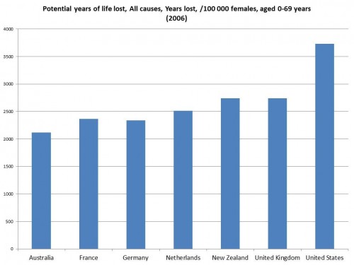
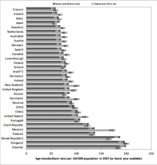
However, on the measure of mortality amenable to healthcare the United Kingdom performed worst in 1997-8 and second worst in 2006-07 of the seven countries Osborn compared for this (France, Australia, the Netherlands, Germany, New Zealand, the UK, and the US).
So the UK enjoys a great health service but not great health, a puzzle that the conference participants never fully tackled. One who tried was Liam Donaldson, the former chief medical officer. “I think it strains credibility to say we have a world class service,” he said in response to Osborn’s presentation. “I don’t think it is.”
When I first read that, I thought that the NHS must be making tradeoffs. The system is dirt cheap. They’re kicking butt in access. It’s not surprising that quality might suffer. But then I got to thinking. They’re “second worst” now in terms of amenable mortality? Who’s the worst?
This kind of stuff drives me a little crazy. I have no idea if anyone in the US will cover this story. If they do, however, I bet it will be along the lines of the title. Sure, the UK does well in terms of access, but their outcomes are terrible. Do you want that to happen here?
What will be missed is the fact that the outcomes are, perhaps, terrible, but they are worse here. So “would I want that to happen here”? If you mean that we could spend less than half of what we do on health care, see access improve massively, and see our outcomes go from worst to second worst? I could live with that.
For the record, using 2010 data, the UK would have moved up a spot. The US would still be last.
UPDATE: Yes, I used PYLL instead of amenable mortality. They’re not exactly the same, but it’s what I could get easily from the OECD to make a chart of just the mentioned countries. But fine. Here’s amenable mortality, but with a lot more. For the seven that are listed above, the story is the same:


