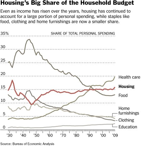
I was totally wrong about the graph I posted earlier today. I could claim color blindness, but I won’t (I’m not). Thanks to sharp-eyed commenters who corrected me. Let’s try again.

See the health care line? It isn’t the one on top, though that’s what I thought at first. Sure, it ends up on top, but it starts way down below 5%, second to bottom on the left hand side. It crosses the line for food just after 1990. Both the health care and food lines are grey, which is what confused me. (Clearly the NY Times, from which this graph comes, can use color. How ’bout a bit more. That would help!)
So, the proportion of personal spending on health has gone through the roof, while food spending has gone way down. As I mentioned in my earlier post, this may not even reflect employer and government health spending.
So, yeah, we’ve got a health spending problem.
Or, do we? If other goods are becoming cheaper and if we think of health as a luxury good (for which it is natural to expect to spend more as incomes rise), maybe we should not be so alarmed. Having already blown the interpretation of this graph once, I’ll stop there. Food for thought. No, not food! Health care. Health care for thought. Sheesh!


