Um…I was totally wrong about what I wrote below. Corrected in a new post. Don’t even read the following.
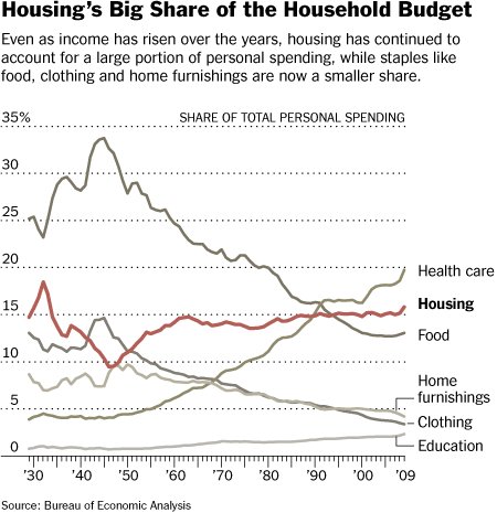
In a post on the cost of housing, Matt Yglesias included an interesting figure yesterday (it originated in a David Leonhardt column).

[The following is totally wrong. See correction in a new post.]
Anything look funny about this? Oddly, neither Yglesias, nor Leonhardt, nor the chart’s own caption make any mention of the line that exhibits the most movement. It’s right there at the top of the figure: health care! That’s not the most striking thing. The most striking thing is that the proportion of personal spending on health care declined a lot from 1940 to 2000. It was cut in half. That’s amazing. Since 2000, the proportion of personal spending on health care increased quite a bit too, going back to the level achieved in the late 1970s. Out-of-pocket health costs have really gone way up lately. No wonder people are upset.
Still, looking at this graph alone, one might think, “What health care cost crisis?” We’re spending far less of our personal resources on health care than at any time from 1940 until the late 1970s. What’s the big deal? What are we so worked up about?
I suspect what this reveals is that the government has taken on an increasing share of health care costs. Medicare and Medicaid budgets are exploding. In effect, we’re paying for that too, just with taxes (current or debt-deferred).
Employer spending on health care–which really took off after WW II–is probably also not reflected. We pay for that too through lower wages. (I’ve got a full post on just that coming up; if you can’t wait, read this old one.)
Nevertheless, it is striking how much less we directly spend on health care today as compared to most of the post-war period. Likely, this fact is part of why health care costs have gotten so out of control. If the average Joe just doesn’t perceive government or employer health care spending as acutely as his own then he overlooked a major national budgetary hemorrhage. From this perspective, I can certainly see why some are so passionate about consumer directed health plans. More people have to feel the pain (though many really are already). The figure suggests that, in aggregate, we just aren’t–not directly anyway, which is what counts.

