There have been a lot of excellent comments and questions. I wish I could get to them all, but there are only so many hours in the day. I am going to try to get to some, though, and this post is a start.
1. Many of you (physicians) take exception to the post on how much docs earn. Some of you claim that as long as a shortage of physicians exist, docs will make more. Fair point. But there’s likely not a shortage because docs don’t make enough, as we obviously make more compared to other countries. It could be because we don’t train enough physicians, but that can be fixed.
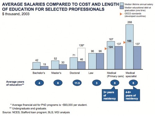
Other reasons cited include the high cost of education. Having paid a small fortune for my education, I don’t disagree it’s expensive. But is this the reason for the overspending? I’m not sure. Here’s another chart from an older version of the McKinsey & Company paper:
The bubbles underneath the x-axis show how many years various professions are in school/training. The dark shaded columns are the median educational debt at graduation. The light shaded bars are the median lifetime annual salaries. I don’t know how much higher the light shaded column should be than the dark shaded one. But you don’t hear lawyers complaining about this as much as you do doctors, and our light shaded bar is much higher than our dark shaded bar.
Some of you are complaining it’s malpractice insurance. But malpractice insurance is a business expense and not salary. Most doctors aren’t paying for their insurance in after-tax take home pay.
2. A lot of you are angry that England and Japan aren’t in the graphs. I didn’t make all of them, so I can’t say why they aren’t. I’m going to try and replicate the key chart as soon as I can. Don’t get your hopes up, though. England and Japan are two of the cheapest health care systems around, and are not going to make that line’s slope higher.
3. One of you snarkily said that in the “science world” an r2 of 0.76 isn’t considered significant. I would normally ignore this, because I don’t appreciate the tone. But others may read this and think you are right. So I invite you to find me a source that claims what you say is true. I think you may be confusing a p value and an r2 value, but I won’t claim to know what’s in your head.
4. Some of you claim I don’t understand the difference between cost exposure and paying more. I assure you I do. I don’t think exposing people to the cost of care will work nearly as well as you think. Here are a few posts that might explain why:
The moral hazard
The moral hazard – ctd.
Medicare and increased cost-sharing
5. Many of you still think it’s obesity. Here’s why I disagree:
6. Many of you still think it’s all malpractice. It’s not. And while those costs are real, tort reform still won’t work. Read these posts:
Health Affairs Covers Malpractice
The odd logic of tort reform
The odd logic of tort reform – ctd.
7. Some of you are upset with me because I didn’t go into detail on one point or another. You’re right. This is a blog, not a book, and I have to limit myself to a certain length of post or I lose people. Moreover, this was already a 10-part series, so I already think it was long. I wanted to do something that would be a start. I also did not spend a lot of time on the why as much as the what. I think the why we overspend is even more complicated, so please forgive me for not completely answering that question.
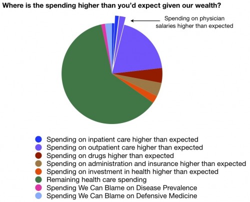
8. Some of you were confused by the chart. Let me explain it again:
The green part is health care spending that is in line with GDP. It’s what we can expect to pay given our wealth. You can argue we could spend more for better outcomes, but since we’re not getting them*, there’s no reason to spend more.
The slivers that start at the top and move clockwise are areas of overspending. Since the physician overspending is entirely included in outpatient and inpatient overspending, I pulled those parts out for you.
There was no good way to show underspending, so I didn’t try.
The prevalence and malpractice spending are at the end. Those of you who pointed out that those should be inside the other slivers of overspending (like physicians) are correct. But there was no way for me to accurately portray that, nor do I have good data to know where they lie, so I didn’t try. I included them as separate slivers so that you could see their relative size.
*I promise you, the Outcomes series is coming.


