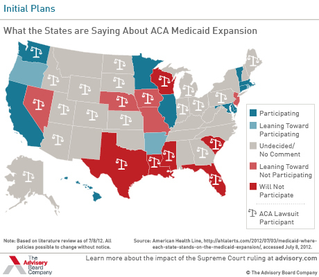
The Advisory Board is tracking which states claim to be opting in or out of the Medicaid expansion, or leaning one way or the other. Here’s their map:
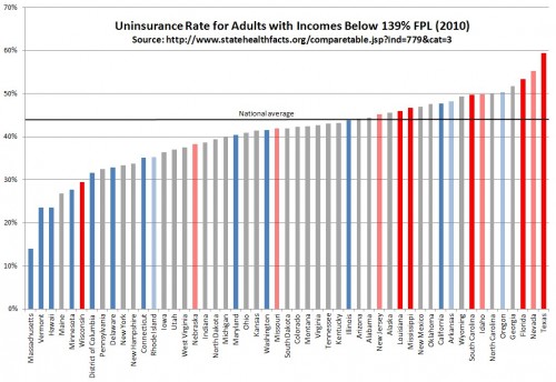
Using the same color coding, here’s my chart, based on statehealthfacts.org data, of the uninsurance rate by state for the Medicaid expansion target population, adults with incomes below 139% FPL.* Click to enlarge.
Notice that dark and light red states (those saying they’ll opt out or leaning that way) tend to cluster at the high end of the distribution. All but three of them have uninsurance rates above the national average. Dark and light blue states (those opting in or leaning that way) tend to have uninsurance rates below the national average, though three do not.
Translation: States with populations that would benefit more from the expansion are disproportionately against adopting it. It also may be true that in those states the price of expansion is higher (more people, higher price, though you can’t infer the price from the proportion of uninsured). However, most of that price tag will be covered by the federal government and, on balance, many states will actually see a net savings due to reform.
* You’ll see it written as below 134% FPL (or up to 133% FPL), but there is a 5% income disregard that makes it effectively below 139% FPL.


