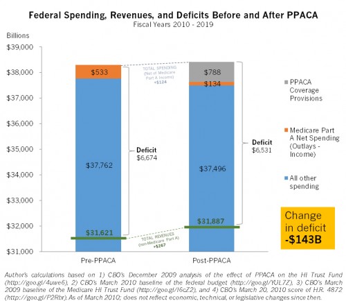
Commenter “DreadGazebo”, a public finance economist, put some real numbers to my (not) double counting in Fraktopia sketch. His chart is to scale.
Notes:
- This is all based on CBO estimates (just like my Fraktopia one), but the real-world US Government CBO (obviously not like my Fraktopia one).
- I checked the numbers. If you want to as well, here are the sources in clickable form: (1) CBO’s December 2009 analysis of the effect of PPACA on the HI Trust Fund, (2) CBO’s March 2010 baseline of the federal budget, (3) CBO’s March 2009 baseline of the Medicare HI Trust Fund, (4) CBO’s March 20, 2010 score of H.R. 4872.
- Total spending goes up from pre- to post-PPACA, but the deficit declines due to increased revenue.
- Also, Medicare Part A net spending goes down, way down.
- This is not double counting.
- One can therefore say that the date the Medicare Part A Trust Fund* is exhausted is pushed further into the future and the budget deficit is reduced. If one dislikes that statement it is probably on the basis of either (1) one thinks Trust Fund* accounting is a farce or (2) one dislikes how some of the net revenue is spent (e.g., the $788B on coverage expansion, for example). The first objection is not specific to the PPACA. The second is not specific to Medicare. It’s actually hard to logically tie reduced Medicare spending (Trust Fund* extension) to the coverage expansion except insofar as both are due to the same law. Apart from that, the coverage expansion has nothing to do with Medicare. You can, therefore, affect Medicare spending (the Trust Fund*) without affecting coverage expansion and vice versa.
- The chart, by necessity, depicts totals for fiscal years 2010-2019. One needs relatively detailed CBO pre- and post-PPACA budget figures that breaks out the effect on the Medicare Part A Trust Fund.* This only exists for 2010-2019.
- Because it represents 10-year totals, the numbers are massive. Yes, that’s $38-some-odd thousand billion in spending, or $38-some-odd trillion for those of you scoring at home.
- The vertical axis does not extend down to zero. If it did, we’d see (or not see) clearly that a deficit reduction of $143B is very small. It’s probably in the noise.
- DreadGazebo chose only to highlight in orange Medicare Part A spending, net income, not all Medicare spending net income, reflecting something I raised in a recent post about the Medicare Trust Funds.* To the extent any of the Trust Funds* are real, it’s the Part A one. When we talk about the exhaustion of the “Medicare Trust Fund*” it’s the Part A fund we speak of. The other funds cannot exhaust under current law.
- DreadGazebo chose to net out income from Part A because PPACA did two things with respect to Medicare (Part A). It cut hospital spending and it raised revenue for the Part A Trust Fund.* If DreadGazebo had only shown the decline in Medicare spending, it would understate the effect PPACA has the Trust Fund* balance.
Finally, this is irrefutable evidence that TIE has awesome readers. I’m grateful that DreadGazebo put the time to produce this chart. Thank you!
* I suggest interpreting “Medicare Part A Trust Fund” as “the obligation by future taxpayers to Medicare Part A in the amount of the cumulative sum of Part A revenue, including interest, less Part A expenditures”. Got a better definition? Lay it on me in the comments. Also, even if you hate the tortured Trust Fund concept, I assure you every president and the vast majority of members of Congress will rhetorically stand by it when it is convenient for them to do so. Finally, if the idea that some view the Trust Fund as farcical is new to you, look here.


