
Last week the health policy wonkosphere exploded with the news that total U.S. health spending had grown by 9.9% in the first quarter of the year as GDP grew only 0.1% (both annualized rates) and the rate of growth in the health care workforce held steady. These new developments could suggest profound, surprising changes in the health system are underway, or they could be speculative, noisy signals of something we basically expected. Which?
First, let’s put the numbers in recent, historical context. To the charts!
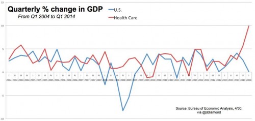
The chart just below shows time series of GDP (blue) and health spending (red) (source: Dan Diamond). Over the period shown (2004-2014Q1), only during the depths of the Great Recession has the gap between health spending and GDP been as wide as it appears to be today.
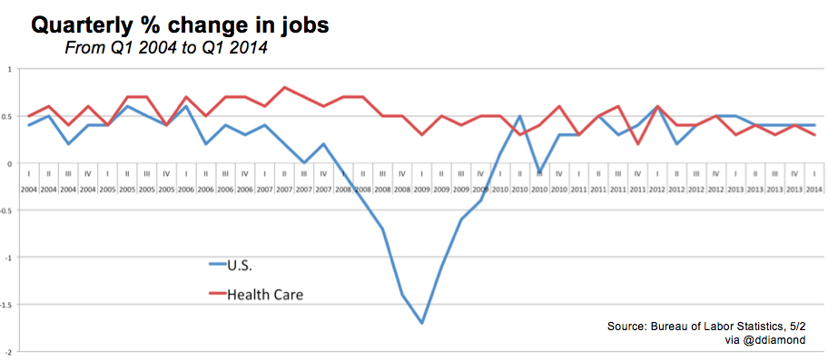
The next chart, below, illustrates growth in the health care workforce (red) alongside total workforce (blue) (source: Dan Diamond, again). The growth rate of health care jobs has fluctuated a bit, but not much, especially relative to that of all jobs.
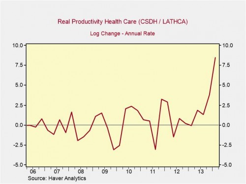
Willingly suspending disbelief for a moment, these time series suggest that Americans recently poured a lot more of the national economy into health care without moving the needle on the rate of growth in real, human resources (jobs) devoted to delivering care. This would imply at least the possibility of tremendous growth in health care productivity (accelerated growth in health care delivered with steady growth in resources delivering it). Peter Orszag’s chart, just below, makes this productivity hypothesis clear. Ignore all the technical details at the top of the chart; it’s basically the annualized percent change in ratio of health spending to health care jobs.
Are we witnessing the beginning of a new era of more productive health care delivery? Probably not, or at least not to the extent the charts above would suggest, if naively interpreted. In what follows, I’ll walk through the possible interpretations and various limitations upon which to hang considerable skepticism. Timothy McBride expressed many of them in his excellent post as well.
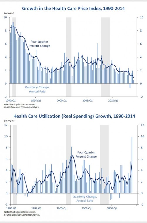
Prices vs. utilization vs. “utilization”. First, let’s be clear about whether health spending is growing because of price or utilization changes. This is almost simple: it’s not prices. As shown in the first chart below, from the White House, price growth has been steadily declining since the recession.
But the most recent growth is only kinda utilization. To be sure, recently utilization has grown, as shown in the second chart below. But the most recent spike might not accurately reflect actual health care use. It’s an initial estimate of what that health care use might have been, but not a direct count of what it actually was. There’s reason to believe that during a period of rapid growth in coverage, this approach can overstate actual utilization. I’ll call this “utilization” (in quotes).
In a Business Insider post by Brett Logiurato, Peter Orszag made this utilization/”utilization” distinction. He has to invoke magic to interpret the results shown above as productivity-driven. (Pro tip: As a policy intervention, wonks don’t really trust magic.)
What Orszag thinks it might come down to is a flaw in how people interpret the uptick in GDP numbers, given how they are calculated. For example, once someone qualifies for Medicaid, that counts as an increase in both their income and spending, even if they don’t actually consume health-care services, Orszag said. About 4.8 million qualified for Medicaid coverage through the program’s expansion under the Affordable Care Act, the White House said Thursday. […]
“[The results in the chart above] would mean that somehow we’re able to produce so much more health care with each worker, in a dramatic fashion, starting magically with the fourth quarter of last year,” Orszag said. “OK, maybe? It’s just not really plausible. If all of this were real, it would mean that suddenly, magically, health-care workers have become a lot more productive.”
The same point about Medicaid payments counting as health care utilization spending would be true of spending on premiums for marketplace plans. As the uninsurance rate falls, these types of spending automatically rise. If we mistake premium and subsidy payments as actual use of health care services, we’re going to misunderstand health system dynamics in the short term. In the long term, premiums and program payments should translate into actual utilization. (For much more on how the Bureau of Economic Analysis makes initial estimates of health care spending—relying in part on “judgmental trends”—see this PDF.)
Noisy, preliminary data. Let’s not jump to conclusions. Every one of the new numbers—on health spending, GDP, jobs—are preliminary, subject to future revision, and are inherently noisy. Neil Irwin and Kevin Quealy illustrated the noisiness of jobs numbers brilliantly on The Upshot. (It’s worth at least the 15 seconds it will take you to click over and scroll down to their first graphic to get the idea.) The same phenomenon applies to estimates of all economic indicators, and, indeed, all things.
The headline health spending growth rate—9.9% in the first quarter of 2014 (annualized)—is particularly likely to be wrong and revised downward in the future. As already noted, it is an extrapolation by the Bureau of Economic Analysis using an approach based on Medicaid spending and enrollment. That is, it does not directly take into account other categories of spending, such as that by new marketplace plans. I’ve already written above how this could mislead (utilization vs. “utilization”). Timothy McBride hypothesized another way this could skew the estimate, by focusing on those most likely to use a high volume of care.
Medicaid folks face few copays and deductibles and perhaps the ones seeking health care in the first quarter were the most chronically ill, most unhealthy.
It’s also worth noting that it may be possible for the health care workforce to absorb a surge of utilization without concurrent, additional hiring. Workforce expansion may lag. (Someone more familiar with historical utilization-workforce relationships might be able to say more about this.)
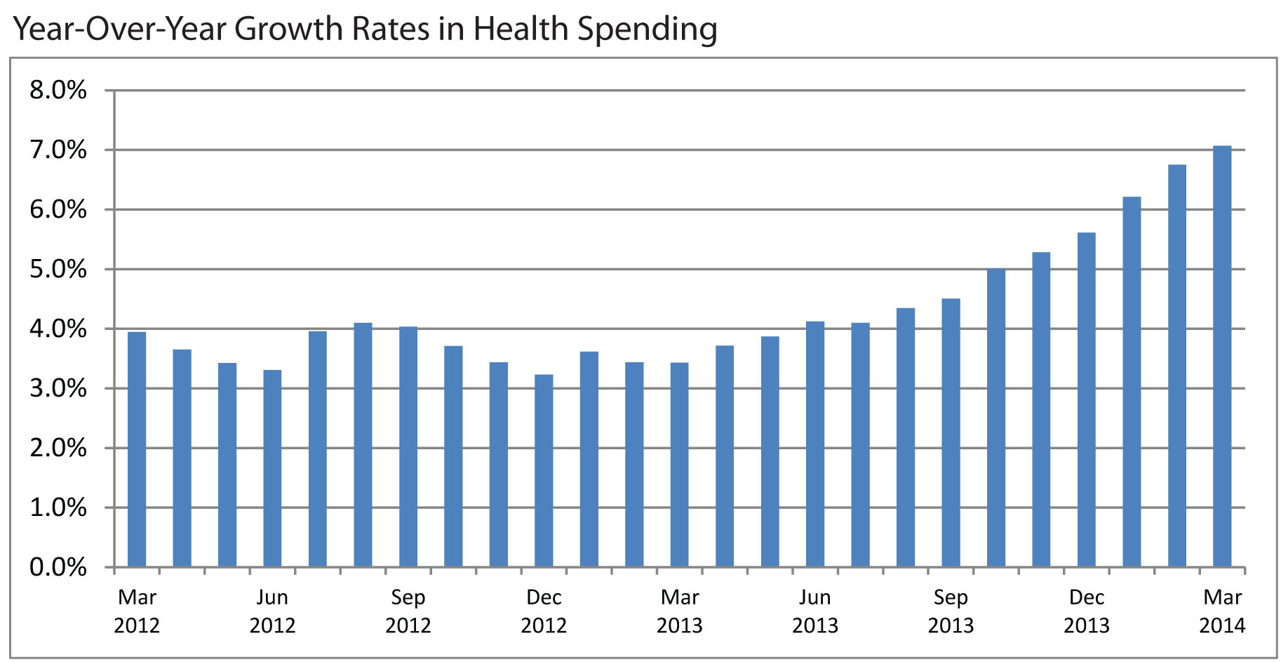
A more plausible health spending growth estimate. Though an official, government revision of first-quarter health spending based on more data isn’t expected until June, we don’t have to wait for a more accurate estimate. Using different methodology, the Altarum Institute has already estimated more modest acceleration in growth, up about 7% in March 2014, as shown in the chart below.
To be sure, even this is rapid growth, but it may be closer to a rate we should expect. Years ago, some predicted just this, as coverage expansion phased in. As David Cutler tweeted,
@mcbridetd @LenMNichols @cromwick Altarum, based on GDP data, shows increase over prior year growth of 2-3% (1/2).
— David Cutler (@Cutler_econ) May 3, 2014
@mcbridetd @LenMNichols @cromwick Best explanation I've heard so far: Medicaid expansions in 2013:Q4 and that + exchanges in 2014:Q1. (2/2)
— David Cutler (@Cutler_econ) May 3, 2014
It probably comes as no surprise to many readers that expansion in exchange-based coverage in early 2014 might drive health spending higher (about which more below), but what’s this Medicaid expansion in the fourth quarter of 2013 of which Cutler tweets? Wasn’t Medicaid expansion implemented in 2014, along with exchanges?
Actually, no. Some states expanded their Medicaid programs early, which could, in part, explain growth in health spending prior to 2014. A paper by Sommers, Kenney, and Epstein has the details (h/t Adrianna):
Since 2010 California, Connecticut, Minnesota, and Washington, D.C., have taken advantage of the law’s option to expand coverage earlier to a portion of low-income childless adults. We present new data on these expansions. Using administrative records, we documented that the ramp-up of enrollment was gradual and linear over time in California, Connecticut, and D.C. Enrollment continued to increase steadily for nearly three years in the two states with the earliest expansions.
More coverage leads to more spending. A plausible and empirically validated result in health economics is that health insurance encourages more spending on health care. So, as Cutler suggests, if Obamacare is increasing coverage or its generosity, we should expect an uptick in health spending. This could be due to a “moral hazard” effect, essentially the use of care that is valued less by insured patients than it costs to provide—health care they would not consume if they had to pay the full price out of pocket.
But some care forgone or deferred while uninsured or underinsured could still be valued at least at its cost but is not consumed due to income (or wealth) constraints. When consumers who don’t use care for this reason become insured, health care spending can also spike. This would be better called a “pent up demand” effect, as distinct from moral hazard.
A way one might separate pent up demand from moral hazard is to compare short- vs. long-run increases in utilization. Moral hazard should persist, but pent up demand should dissipate over time as people receive the services they highly value and need but had deferred. About this, Dennis Shea tweeted intriguingly,
https://twitter.com/DennisG_Shea/status/461641056988459008
(If anyone is aware of work that substantiates this, please let me know.)
A knock on Obamacare is that some of those who now (or will) have Medicaid or marketplace coverage were already insured. To the extent they were, and provided that coverage was not substantially less generous than Medicaid/marketplace coverage, there ought not be any changes in moral hazard and there wouldn’t be any pent up demand. Any new moral hazard/pent up demand effects must be due to people acquiring new or substantially more generous coverage. Thus, observations of large increases in utilization are consistent with the idea that many new Medicaid/marketplace enrollees were not previously covered to the same extent they are now, if at all. Put another way, a spike in utilization is expected if Obamacare is covering the uninsured and underinsured—”success,” as some define it. (Empirically, there is some uncertainty as to the proportion of marketplace enrollees who were covered at time of signup; see pages 37-38 of this ASPE Issue Brief. H/t Adrianna.)
Don’t forget the economic recovery. We should not forget that a longstanding finding in health economics is that health care spending is related to current and prior (up to five or six years prior) economic growth. That is, as the economy improves from its lows during the Great Recession, health spending should pick up even apart from any Obamacare effect.
In conclusion, we should not put too much weight in recently released macroeconomic indicators of GDP, jobs, and most especially health care spending. They’ll be updated. However, the general trend of more health care utilization is to be expected, both due to economic recovery and coverage expansion. Any inference that the health system is functioning substantially more productively is premature.
