
By now, I’m sure you’ve read an article on how we’re dying at higher rates of so many, many things compared to the rest of the world. All that is from an IOM report that I haven’t had the time to read fully yet.
But Austin pointed me to a site which allows you to look at some of their data in charts. Honestly, I’d like to post them all. Since I can’t do that, I’ll focus on some of my favorites. Let’s start with pregnancy and birth.
This is deaths from maternal conditions related to pregnancy:
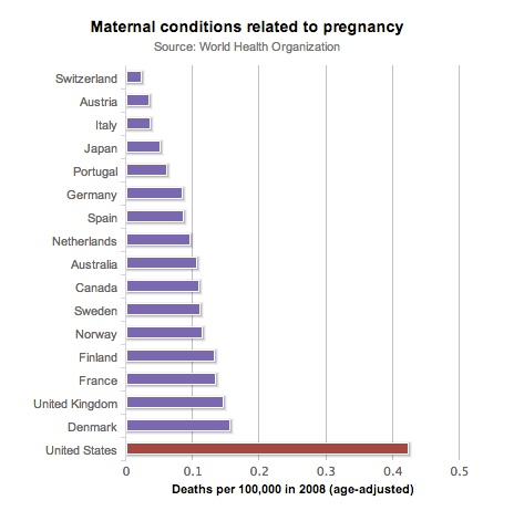
That’s moms dying, not kids. Look at how many more mothers – women – die from pregnancy related conditions in the US than in any other comparable country.
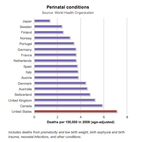
Here’s deaths from perinatal conditions:
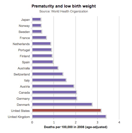
Here’s deaths from prematurity and low birth weight:
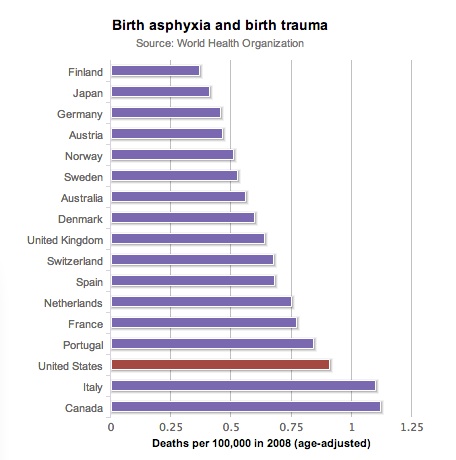
Here’s deaths from birth ashyxia and birth trauma:
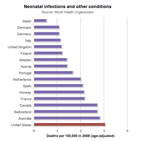
Here’s deaths from neonatal infections and other conditions:
Here’s how much we spent on health care per person, relative to other countries, leading up to 2008:
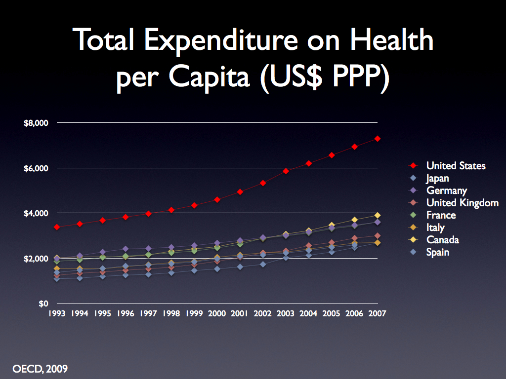
Best in the world? Keep on telling yourself that.
