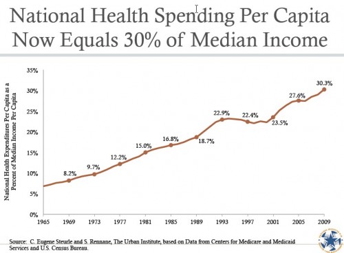
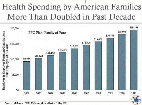
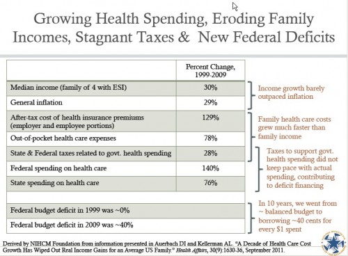
For my money, Julie Schoenman of the National Institute for Health Care Management (NIHCM) produces some of the most attractive and informative charts on health care spending and related issues. You can find a huge set of them on the this NIHCM web page. Scroll down to the “Additional Slides with New Graphs on Health Care Spending” section (see the PDFs that begin “Chapter 1,” “Chapter 2,” etc.). Aaron posted some recently here and here. Below are three more that caught my attention. They require no additional comment.


