A commenter looked at the chart showing that life expectancy at birth was decreasing in some areas of the country, and asked for life expectancy at age 65 instead. I replied that I lacked the data.
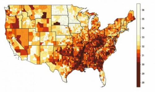
Well, an eagle-eyed reader* sent me the following two charts. This is female life expectancy at age 50 by county:
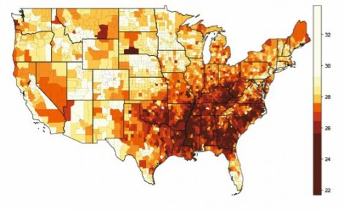
And this is male life expectancy at 50, by county:
The darker areas are places where life expectancy is shorter. I hope you’ll see that there are tons of places in the South where life expectancy at age 50 for men is 25 years or less. This means that men retiring at age 67 instead of 65 would lose 2 of their 10-years-or-less of benefits. It’s not much better for women.
Bottom line – there are huge disparities for how many years we get to use Medicare. Everyone isn’t getting older equally, and raising the age of eligibility affects some far more than others.
Here is a link to the full report, “Geographic Differences in Life Expectancy at Age 50 in the United States Compared with Other High-Income Countries“.
*This was sent to me by Fred Zimmerman, who I’ve known since my Seattle days. Here’s a paper of his that you must read. Here’s a video about that paper.


