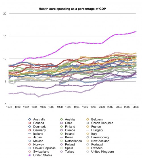
Well, I’m just having too much fun with my new OECD data access. I am trying to focus on getting the series on quality done. But here’s something I just whipped up which goes back to costs:
What you are looking at is spending on health care as a percentage of GDP going back 30 years. Lest you think I’m cherry picking, I’m showing you data from all 31 OECD countries. It’s not hard to pick out the US line, is it?
We should spend more money than other countries. We’re richer than them. But should we be spending so much more of our GDP on health care?
Look at the slope of our line compared to every other line. Yes, spending as a percentage of GDP is rising pretty much everywhere. But it seems to be rising much faster in the US. The gap between us and all other countries is just getting bigger.
Is there anything about this chart that doesn’t make you worry?
From Austin: There are two related posts today: (1) Aaron’s compendium of health spending vs. GDP regressions and (2) my counterpoint that describes how some economists think our health spending is optimal.


