If you haven’t read the introduction, go back and read it now. That introductory post also includes links to all the posts in this series on what makes our health care system so expensive. Each of these pieces is going to discuss one of the components of unexpected spending that accounts for why our system is so expensive.
Remember, these posts are going to follow a common theme. I am going to highlight how the United States is spending more than you’d expect given our wealth. Much of this comes from the McKinsey & Company study, Accounting for the cost of health care in the United States.
This post is not going to make me popular (especially with many of my co-workers), but it’s real and it’s significant. It’s about the salaries of our health care workers. It’s also going to be slightly different in that these salaries are already bundled into inpatient and outpatient care. No one gets a free pass in this series, though, and we need to acknowledge this real and not insignificant part of our health care costs.
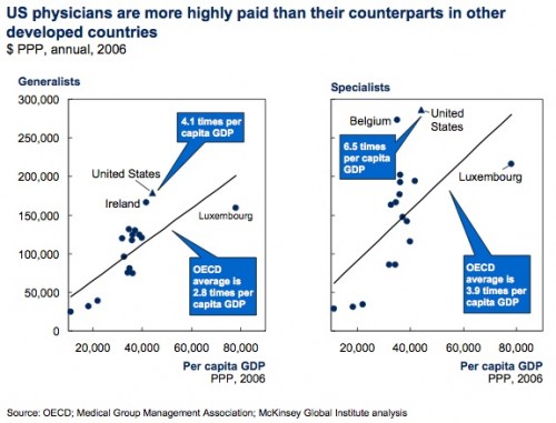
In 2006, physician salaries accounted for $138 billion in health care costs. About $64 billion of that is above what you would expect for the wealth of the United States. In the United States, physician salaries were 6.5 times GDP per capita for specialists and 4.1 times GDP per capita for generalists. In the other countries in this analysis, these multipliers were 3.9 for specialists and 2.8 for generalists.
Now it’s important to note that this doesn’t just mean that physicians in the US made more than physicians in other countries. It means they made more compared to the rest of US citizens than physicians do compared to the physicians in other countries do compared to their citizens. You can see it in this chart:

Each time the dot is above the line, it means that we are spending more than you would expect for our wealth. Again, that’s OK if you can somehow justify the cost. Maybe you think that physicians in the United States are so much better than the physicians in other countries that we have to pay them more, even when compared to other professions in the US. You’d hope to see really improved outcomes though. Others make the argument that physicians in the US have longer or more expensive training than other professions and that justifies their increased salaries. Analyses show, though, that this cannot completely compensate for the difference.
Let me be clear. Maybe you can justify the higher salaries of US physicians compared not only to physicians in other countries but also to other US workers. But you can’t deny those higher salaries exist.
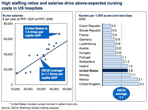
The salaries of nurses are not nearly as inflated in the United States. In 2006 they were, on average, 1.5 times GDP, not much different from the 1.1 times GDP seen in other countries.
What’s different is how we use our nurses. Regulations in the United States often force higher staffing ratios than found in other countries, meaning that we use more nurses per patient than other countries do. Maybe this is worth it, maybe it isn’t. But it’s another added expense.
I will say this at the end of every one of these pieces. None of this proves that this money is wasted or fraudently taken. Nor am I saying that we shouldn’t spend more money than other countries. But this is money that goes above what you’d expect us to spend based on our greater wealth. We should at least be able to account for and explain this increased spending in some way.
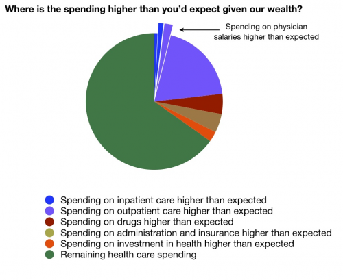
 You’ll note this pie chart is different from the ones that preceded it. This is because the cost of health care workers is part of inpatient and outpatient costs, which have already been described. I just thought you should see their relative amounts in some way.
UPDATE: Edited for clarity.


