Earlier this week, I presented some charts and commentary to The Health Management Academy’s Treasurer Forum. All of the content of my talk has appeared on this blog before, but not precisely in the form I gave it. In putting the talk together, I realized I could demonstrate in three charts how tight a spot we’re in with respect to health care.
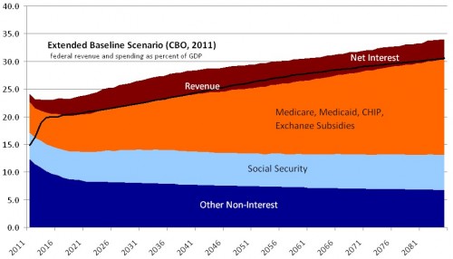
First, if federal tax revenue hugs the historical average, the CBO predicts massive growth in interest on the debt, which itself will grow due to rising health care expenditures.
It is relatively uncontroversial that the scenario depicted above will not happen. It will either not happen in a catastrophic way: soon after the debt-to-GDP ratio exceeds 90%, as expected in 2021, the US will face growing interest rates that will constrain borrowing. We will be forced to slash program spending. Or, the above scenario will not happen in a kinder, gentler way: we will begin to get health spending and deficit spending under control, as well as increase tax revenue. Those will allow us to step back from the cliff.
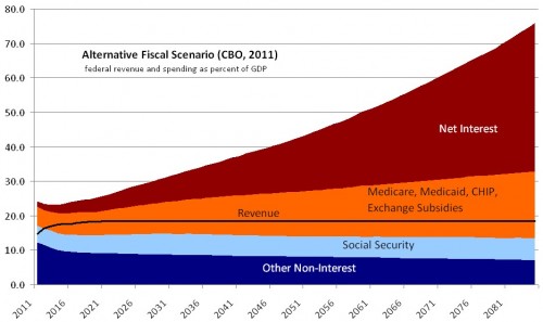
In that case, it might play out like this:

Though it is certainly possible, in principle, to increase federal tax revenue to the extent depicted in the foregoing chart, I assert that this will not happen either. I just don’t see a good reason to expect Americans to tolerate the US government consuming a level of tax revenue so far above historical norms (roughly 19% of GDP). The current political debate illustrates the difficulties in raising taxes.
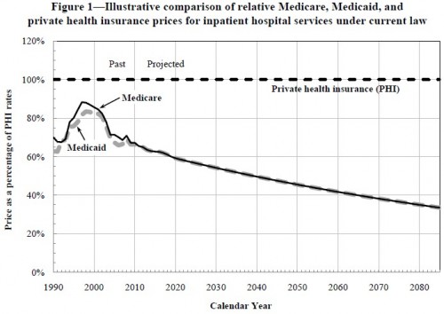
If taxes don’t go up or up enough to dig us out of the growing debt and interest payments, another option is to cut back on the type of government spending that is the long-term source of the problem: health care. However, by law Medicare payments to providers are already destined to be cut to the bone. The figures in the following chart are already built into those depicted above.
This chart, from the CMS Office of the Actuary, illustrates a projection of Medicare hospital payments, relative to those of private health insurance, under current law. I’ve shown a similar one for physician payments. I assert this will also not happen. There is just no reason to believe that Congress will permit Medicare payments to fall as far below private health insurance payments as depicted. There’s no way providers would see many Medicare patients if payments did fall that low.
To review, here’s the tight spot we’re in: (1) We can’t tolerate decades more of current rates of debt growth and interest payments on the debt (the first chart). (2) We aren’t likely to increase taxation sufficiently to reverse growth in debt (the second chart). And, (3) it’s hard to see how we cut Medicare provider payments more than already planned (chart three). Are we out of options?
No. There are two other options. One is to transition government out of the health care business. That just shifts the health care cost depicted above from the government to individuals. It may not even reduce total spending, but it will take it (or some of it) off the government’s books. Given the above, it’s not hard to see why some advocate for this approach. It can seem like an easy way out.
The other option is to go big, to stop insisting that the government address Medicare without addressing the entire health system. I’ll come back to this next week.
I’ll leave you with two things to ponder over the weekend, and beyond:
- Nobody has adequately described how it is we realistically navigate out of this tight spot. Most say more reform is needed, maybe preceded by repeal, often without saying exactly what and how. What can be done that is both technically helpful (which is the relatively easier part) and politically realistic (which is where all good ideas meet their demise)? I suppose we’ll continue to do as we’ve done, which is, at best, muddle through until there is a political opportunity to do more or, at worst, repeal potentially helpful, though admittedly uncertain, experiments before they’ve had a chance to play out.
- Look again at the third figure I presented above. The presentation of the data steers your mind in a certain direction. Do you see it? (Here’s a hint: can you think of another way to express the same information but that makes Medicare payment seem sensible and private health insurance payment seem like it is growing out of control? Think about it.)


