
I’m very proud of my Upshot post today, which explores a US health care mystery: our levels of spending and outcomes were among those of peer nations until the early 1980s. Then things went kaflooey (to put it technically). Why?
You can see it in the charts in the piece and read why Joe Newhouse, Paul Starr, Henry Aaron, Garard Anderson, Janet Currie, Sherry Glied, and Ashish Jha think things went sideways around then.
This piece was a ton of work, and I thank Stephanie Caty at the Harvard T.H. Chan School of Public Health for chasing down the data for the charts. Lest you think I was cherry picking the data, the two charts in the piece are far from the only ones that illustrate the phenomenon. Below is one more on outcomes, that appeared in Nicholas Kristof’s piece last summer. It shows that reductions in the rate of maternal deaths during childbirth ceased in the US in the 1980s, and then started to increase in the 1990s. That did not happen in Japan, Italy, Germany, Britain, Sweden, Ireland, or France (Canada has a pattern most similar to ours).
Below is another chart that makes one think about the mechanism. It shows that the growth in annual income of the top 1% took off in the 1980s. Other quantiles of income have either held steady or increased less rapidly. 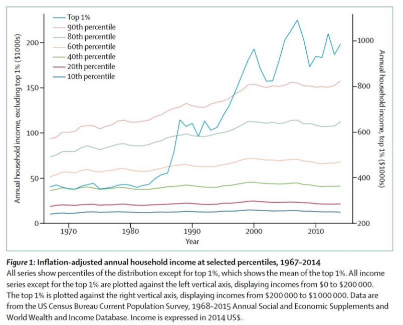
Now, this is pure speculation, but maybe our health system caters to the wealthy. As their incomes grow, so does their demand for ever more expensive, high-tech care that is only marginally better than what came before. Political and social influence being what it is, they get it, but we all pay for it. The share of our economy going to health care grows. But outcomes for the vast majority of the population with lower incomes don’t improve as much, because more high-tech, expensive, low value health care isn’t what they need as badly as they need higher wages, better education, better housing — things provided by other social programs that the health care budget is consuming.
Again, pure speculation, suggested by the charts but not at all proved by them. Anyway, there are tons more charts that show things about the health care system went off the rails in the 1980s. I could do this all day. Go read my Upshot post.
Research for this piece and The Upshot post it promotes was supported by the Laura and John Arnold Foundation.
