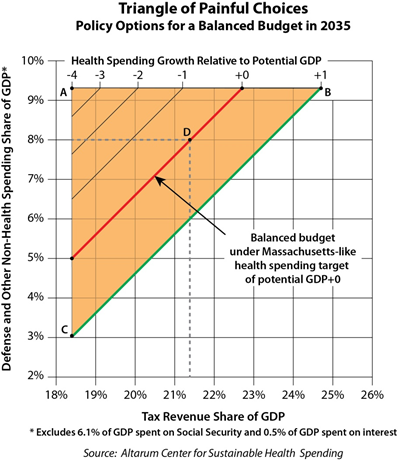
Charles Roehrig of the Altarum Institute offers a brilliant graphical presentation of the federal budget pressure we face, with health care playing a central role. He calls his chart the “triangle of painful choices.” That it is! Take a look (and take your time in reading all the labeling to make sure you understand what it’s showing):
For example, point A represents tax revenues at 18.5 percent of GDP and defense and other non-health spending at 9.3 percent of GDP. These are 2007 values and quite comfortable. However, at point A we only have 2.6 percent of GDP available for federal health spending and, using my model, health spending growth of PGDP- 4, i.e., 4 percentage points below the growth rate in [potential GDP, or GDP at full employment], would be required for a balanced budget in 2035. This is not merely uncomfortable, it is not remotely feasible. Shifting from point A to point B gets to a more feasible health spending growth path (PGDP+1) but raises tax revenues to an uncomfortable 24.6 percent of GDP. Moving down the green line from point B to point C keeps health spending growth at PGDP+1 and brings tax revenues down toward the comfortable 18.5 percent, but spending on defense and other non-health becomes absurdly low.
The red line running through point D represents a balanced budget with health spending held to PGDP+0, which is analogous to the Massachusetts goal of state PGDP+0. At point D, the balanced budget is achieved by setting spending on defense and other non-health items to 8.0 percent of GDP – matching the historical low – and increasing taxes to a record high 21.4 percent of GDP []. There is nothing in this “solution” that is particularly comfortable. Spending for defense and other non-health items is historically low, tax revenues are above historical highs, and health spending growth is extremely low, particularly given the aging of the population. It is possible to move in a direction that is more comfortable in terms of one of the variables (e.g., move down and left along the red line from point D to reduce tax revenues), but this will increase discomfort in one of the other variables, e.g., spending on defense and other non-health items falls below the historical low of 8 percent of GDP.
There’s no way to sugar coat this: we’re in a pickle. It obviously takes some extreme assumptions on one or several of tax revenue, health care spending growth, or levels of defense and non-health spending to make other values for these seem reasonable. But we ought to know by now it is highly unlikely we’ll push any of these to the extreme. What’s far more sensible is a balanced approach, spreading the pain across all sectors, including revenue increases as well as spending and health care growth rate decreases.
Check out of the campaign rhetoric for a minute and just face the math. These numbers don’t lie. They’re very serious numbers. If you want to have an adult conversation, start with these.


