UPDATE: I removed the second chart, because we’ve noticed there are problems with it. Actually, Austin did, months ago. I’m having a week…
This morning, I received two very polite emails:
“I’ve seen some recent arguments comparing the percent of GDP that the US and other countries spend on healthcare. Can you update your chart showing that?”
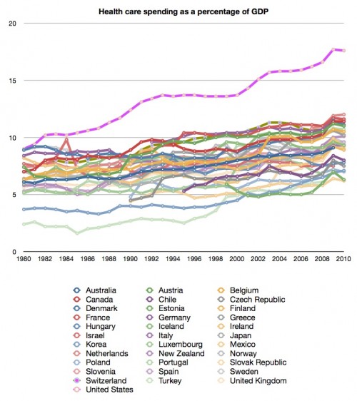
Yes, I can. Here is health care spending as a percent of GDP, 1980-2010, based on OECD data:
You should have no trouble identifying the United States. It’s the one that’s not like the others.
The second email:
“How does the distribution of US healthcare costs compare to the rest of the world? I have found little to help me answer this question. Is everyone else spending 22% of their healthcare dollars on 1% of the population (or even 50% for 5%)?
That’s a great question. I can’t find the same kind of data from other countries that you cite here, although we’ve covered this for the US before. I did, however, find this chart, which is interesting:
As you can see, for lots of people (ie the not-old), our health care spending per person isn’t that different from the rest of the world. For certain groups, however, the differences are startling. This would suggest that our distribution of spending is not the same. If someone has better data, let me know!


