I feel like my last chart made some headway in terms of getting a more accurate picture of “skin in the game”. But it’s not perfect. Kevin Drum had a great idea, which he sent in an email to me:
Your latest chart seems to be the right way to look at this, but it’s hard to read… It seems like it would be a lot easier if you just calculated out-of-pocket costs as a percent of GDP per capita, and then laid it out in a bar chart… it would make the comparison easier.
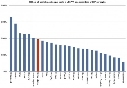
And he’s right. So here it is, 2008 out-of-pocket spending per capita in US$ purchasing power parity as a percentage of GDP per capita. Or, another way, what percentage of per capita GDP is spent in out-of-pocket health care costs. I apologize, but you’re going to have to click through to see it clearly. There are too many countries on it to make it look good here:
Once again, not the most OOP spending (that goes to Switzerland), but we aren’t an outlier on the low end. We have plenty of skin in the game.

