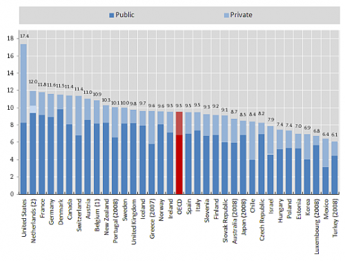
Nothing new here. I just need to post this chart because I keep looking for it for reference. My main takeaway is that the US spends a much higher proportion of its health care dollars privately than do almost all other OECD nations. It looks like only Chile and Mexico may have a nearly equivalent public-to-private ratio as the US.
Total health expenditure as a proportion of GDP, 2009
(Source: OECD)
Here’s Ezra Klein’s description:
It shows that we pay more than any other health-care system and, to add insult to injury, have ended up with more government than most of our competitors, too. It’s the worst of both worlds: a government-run health-care sector that is larger than the international norm, a private health-care sector that’s vastly larger than anything else out there and vast inefficiencies caused by the overlap and poor coordination between the two.


