It’s clear to everyone that the Affordable Care Act (ACA) is what we’re calling health reform now, right? Good.
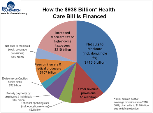
Anyway, Ezra Klein pointed readers to a handy pie chart from The Tax Foundation that shows where the money will come from to pay for ACA goodies. I agree with Klein that it would have been terrific if the creators had broken out the Medicare savings.
Taking a peek at the CBO scoring document it looks like about 43% of the Medicare cuts are in reductions in updates to fee for service rates, mostly for hospital payments I believe. About 30% is cuts in Medicare Advantage payments. The rest is a grab bag of other stuff each piece of which is small.


