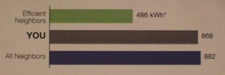
I receive a letter every month from NationalGrid, my electricity supplier. It includes a graph like the one below (which I think was from my March letter) along with the explanation that the “all neighbors” figure was an average of monthly electricity usage for the 100 nearest homes, and the “efficient neighbors” figure was the monthly average of the 20 homes out of those 100 that used the least electricity.
When I saw this graph I was shocked that my home’s electricity usage was not anywhere near that of the efficient group. We pride ourselves on energy efficiency in my home. We’ve invested considerably to reduce our carbon footprint. Why aren’t we more efficient relative to our neighbors?
Then I realized I was beating myself up for no good reason. The graphic that NationalGrid sent me wasn’t that informative. Selecting the 20 most efficient of our 100 nearest neighbors doesn’t make for a fair comparison. There are likely many significant differences between my family and those in that group, including family size and number of hours per week at home (our small children are at home with a parent part of the work week). Without adjusting for such things I don’t think NationalGrid is providing a worthwhile comparison.
I still would like to use less energy. I don’t need NationalGrid to remind me to do so, but I appreciate their effort. I just wish the figures were a little more targeted. No doubt some folks actually change their behavior based on these NationalGrid mailings. There is some evidence that these type of “nudge” letters do contribute toward reduced energy use, a little.


