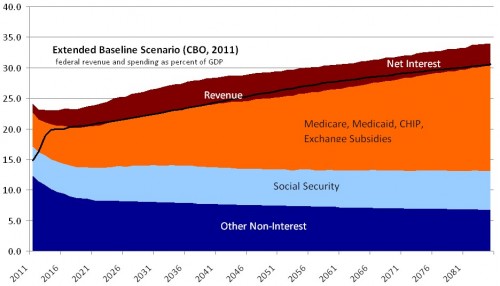
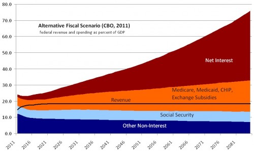
Last year I made some handy charts with CBO’s long-term budget outlook. In various ways they were better than the charts CBO made available. Judging from their popularity on the internet, I’d say people liked them.
Here are updates of them using the 2011 projection. A key difference between these figures and last year’s is that CBO included a year-by-year long-term forecast of interest on the debt, which as far as I know they’ve never done before (and, I’ll add, is something that really annoyed me). So, these figures show both the primary budget (all non-interest spending) and the total budget (which includes interest spending). After the figures are my brief thoughts, all of which I’ve expressed before.
Warning: the vertical scales on these figures are different.
Some possibly useful facts and observations:
- The extended baseline scenario is a forecast that strictly follows current law.
- The alternative fiscal scenario assumes some politically realistic deviations from current law, but that are clearly budget busters.
- Note how unimportant Social Security is in the long run (in that it is stable, not growing).
- Note how massively important health care spending is in the long run.
- Note how the alternative fiscal scenario flat-lines revenue at near the post-war historical average.
- Finally, note the choice here: massive taxation or massive debt. A third way (not shown) is reduction in health care spending.
- As is implied by the above, controlling health costs is the most important domestic public policy issue for the next 50 years.
UPDATE: Added the 7th item above, as suggested by Kevin Outterson.


