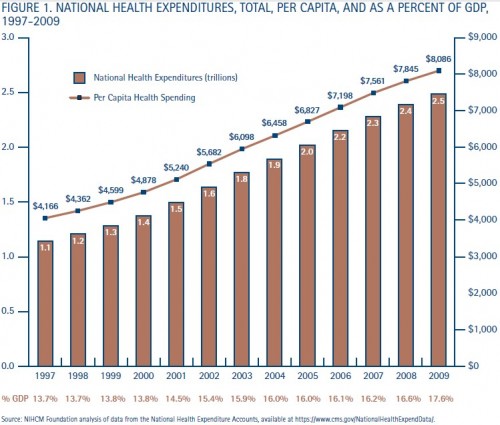
A new data brief from the National Institute for Health Care Management characterizes many of the woes of the U.S. health system with some beautifully designed charts. I’ll be using them in my posts even if they illustrate things already covered many times here. They’re really just too well done not to share. Let’s start with Figure 1, which packs a lot of data into one chart:
I think these spending data speak for themselves, but if you need someone else to “speak” to you about them, check out the data brief.
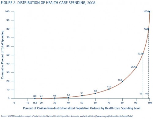
Next up, the spending distribution. Yep, still skewed:
As shown in Figure 3, 15.6 percent of the civilian,non-institutionalized population had no health carespending at all in 2008 and the half of the populationwith the lowest spending accounted for only 3.1percent of all expenditures. In contrast, 63.6 percentof all spending was incurred by the 10 percent ofthe population with the highest spending. The top 5percent of the population accounted for almost half(47.5 percent) of all spending, and the top 1 percentof the population was responsible for 20.2 percent ofspending.
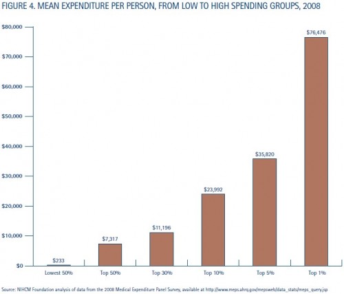
How much, on average, is spent by and on behalf of those in various ranges of the distribution? They’ve got that covered too:
Zowie! If you’re among the unlucky sick in the top 30% of the spending distribution, you’re accounting for over $11,000 in health care, on average. Even the average individual in the top half of the distribution has spending well above the deductible of most “high-deductible” health plans.
I’ll post some more charts from the NIHCM data brief tomorrow. If you can’t wait, you know where to find it.


