If you haven’t read the introduction, go back and read it now. That introductory post also includes links to all the posts in this series on how we can rate the quality of the US health care system. Each of these pieces will discuss another way to look at quality, and how the US compares to comparable countries in that domain.
I won’t lie to you. As a physician trained in one of our “best” (according to US News & World Report) medical schools, I like to believe that physicians in the US are very good at what they do. But that tells you how good care can be, not how good the system is. To understand how our system functions in terms of workforce requires more solid statistics, and is dependent on numbers as well. After all, we like to believe that there are no waits and no rationing; we should have plenty of infrastructure to go around.
For each of these, I will present OECD data on the G8 countries, without the Russian Federation, which does not submit comparative data. I present the G8 countries because of all countries, these are the ones whose relative wealth and standing in the world should make them most likely to compete with us. And, for each of these measurements, I will present all available data from 1990 onwards, lest you accuse me of cherry picking a year. To make it easy to read these graphs, when I am making charts from OECD data, I will always make the United States a nice red line.
Let’s start with general practitioners, or primary care physicians. If you believe the rhetoric going around now, you should expect that the US is not very well staffed with GPs. It’s one of the reasons why many think we do so poorly with respect to preventive care:
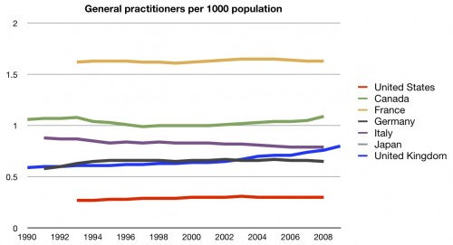
Well, the perception is correct. We have fewer – far fewer – general practitioners per population than any of these other countries. No data were available for Japan.
The other side of this coin is that we are often told that we have too many specialists. They cost more, they do more stuff, and they drive up the cost of health care. So it it true? Do we have a lot of specialists?
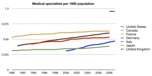
Well, we certainly have more of them. But not as many as you might think. If we are truly low on general practitioners, you would expect that we be truly overflowing with specialists. We’re not. We’re more middle of the pack.
How about surgeons?
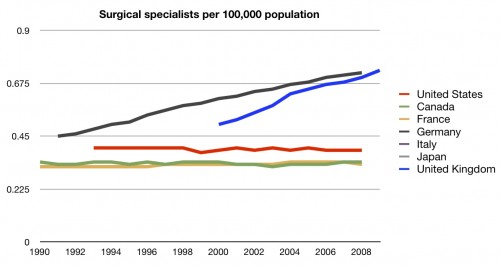
Once again, middle of the road. I have to tell you, the first time I saw this data, I was surprised. After all, I had heard many times how doctors didn’t want to work in other systems. I’d heard how many were flocking to the US. I would not have imagined that we would have so few physicians compared to other countries.
But, obviously, doctors aren’t the only workers in the health care system. Here’s nurses:
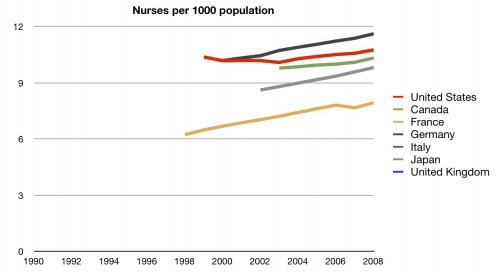
Interesting. Even though we are having a nursing shortage according to most sources, we actually have a fair number of nurses compared to other countries. Perhaps we’re feeling a shortage because our nurses are not being placed efficiently. One way to check that would be to look at the nurse to bed ratio:
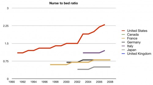
Well, there’s no problem there. We have far more nurses per hospital bed than other countries. This could be, to some, a marker of quality. Certainly it means that there is more nurse coverage in hospitals here than in other countries. But, as we discussed in the cost series, it certainly adds to the cost of inpatient care. Regardless, we’ll give this one to the US. They are clearly in front here.
We still haven’t discussed hospitals and hospital beds. Once again, we have to point back to the fact that many people in this country take pride in their belief that we have more than enough infrastructure to avoid wait times and rationing. So are we loaded with hospitals?
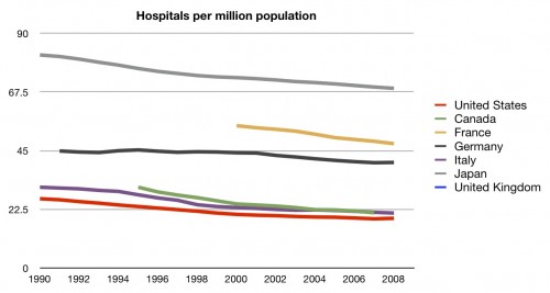
Surprisingly, no. In fact, we are rather short on hospitals per population. Perhaps we have bigger hospitals?
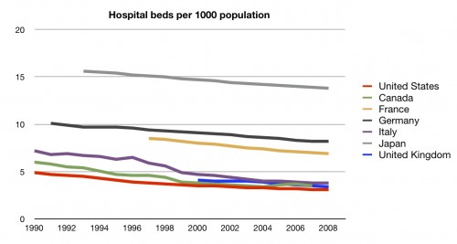
Again, no. Fewer hospital beds per population than any of these other countries.
I admit, this baffles me. Given our huge expense for care, I expected different data than these. Chalk it up to the fragmented and bizzare system we call ours.
Here’s the fourth scorecard:
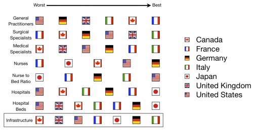
And here’s the running total for the series:
A further explanation of these charts can be found here.
UPDATE: Fixed chart colors thanks to eagle-eyed readers

