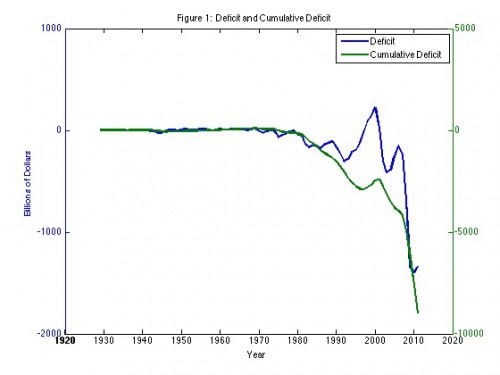
A nice, short post by Robert Dittmar makes a great point in a few charts. Here’s his chart, using Bureau of Economic Analysis data, of the total U.S. federal deficit, by year and cumulatively (aka, federal debt):
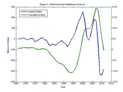
Yow! Here’s what that chart looks like without health care’s contribution:
Cumulative deficit (debt, the green line) would be about zero today if not for health care spending. Dittmar explains,
As a thought experiment, let’s suppose that medical expenditures had been self-financed since the inception of government health care in the 1960s. What would our debt and deficit look like today? To answer this question, I simply added the medical care expenditure deficit back into the total government deficit. The result is depicted in Figure 3 and is astounding (at least to me). Outside of medical expenditures and revenues, the Federal government sometimes ran a surplus and sometimes ran a deficit from 1966 until 1980. Starting in 1980, and lasting until 1994, the government consistently ran a deficit outside of medical spending, but from 1995 until 2010, it consistently ran a surplus. In 1994, the cumulative excess spending would have reached a bit over $1 trillion. But by 1999, debt due to sources other than medical spending would have been completely eliminated by surpluses! The government wouldn’t have needed to borrow again until 2011.


